We put the V in Vikings!
…and all of the other letters too.
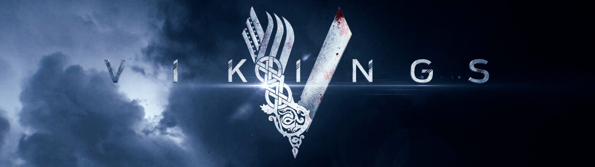
We believe this logo design succeeded in embodying the different facets of “Vikings” in a way that is simple and memorable. We’ve took the letter “V” and elevated it to symbolic status by creating a logo that is bold and iconic at first glance, while also layered with great storytelling detail on closer inspection. The two sides of the letter utilize intricate, yet readable, designs that show the multiple dimensions of the people.
The left side of our “V” tells us about the lesser-known aspect of Vikings: family and life. It seamlessly blends three key elements of their character: the upper section is efficient and almost scientific, denoting how technologically advanced they were, especially in ship building expertise; the middle section is a graphic representation of brotherhood and unbreakable bonds, featuring art reminiscent of tribal emblems; the lower section is all about growth and life, with an illustration that is almost like a section of weaving tapestry, taking visual cues from a family crest or coat of arms.
The right side of our “V” tells another story. It’s about war; the violence and death and conflict that were big parts of Viking society. Shaped like the blade of a sword, we can see small chinks hacked out of what would have been fastidiously hand forged steel weaponry, and we’re exploring the idea of spatters of white, which would indicate the blood of the fallen.
Our “V” will become that symbol, able to live on its own in a variety forms and places. It could exist engraved on a multitude of materials, like wood, stone, or metal. It can do all these things because of its distinctive look, and it explains the depth of the series with one image.