US Open & K+C.
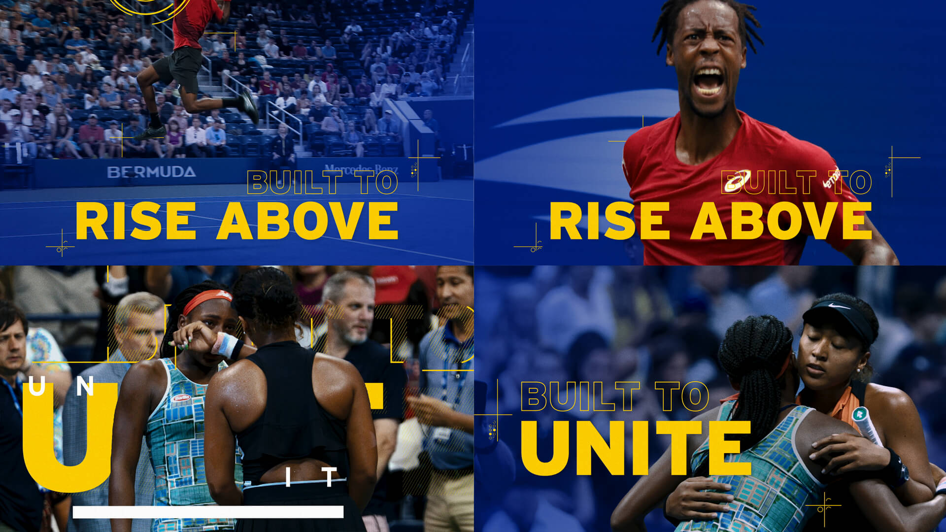
We were inspired by the energy and kineticism of the US Open and the opportunity to bring branded design elements to life that helped channel the sense of movement in each match. Adding type animations over live footage is what K+C does every day around here so for the US OPEN it made perfect sense for us to use graphics and typography to invigorate and highlight the athleticism that makes tennis and the US Open so exciting to watch.
Logo Animation.
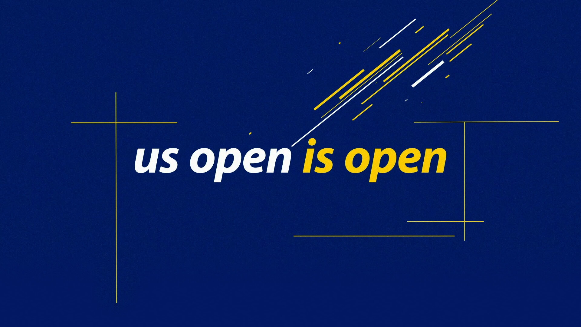
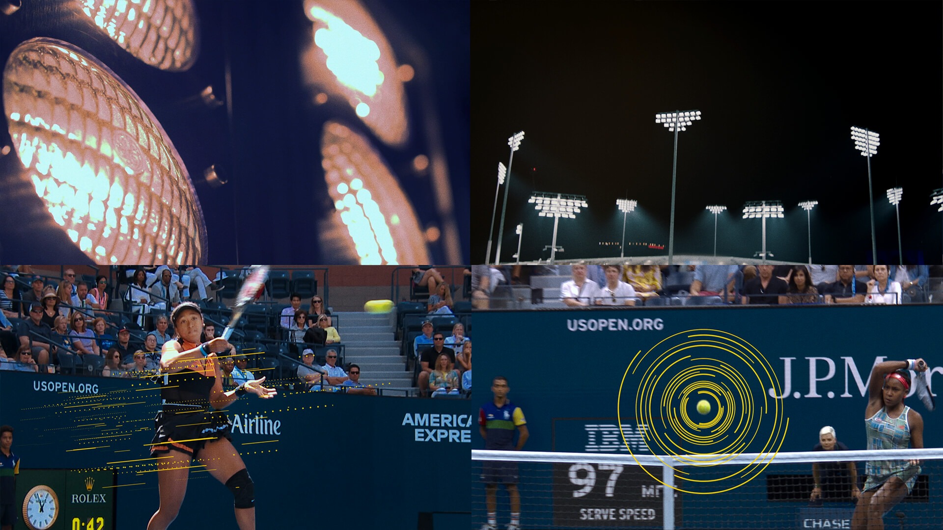
We updated the Logo Animation this year by adding the same energy to it that we show throughout the spot in our graphics. It was also important to the spot to ensure that everyone knew the US OPEN was on and happening even during a pandemic.
Design with Movement.
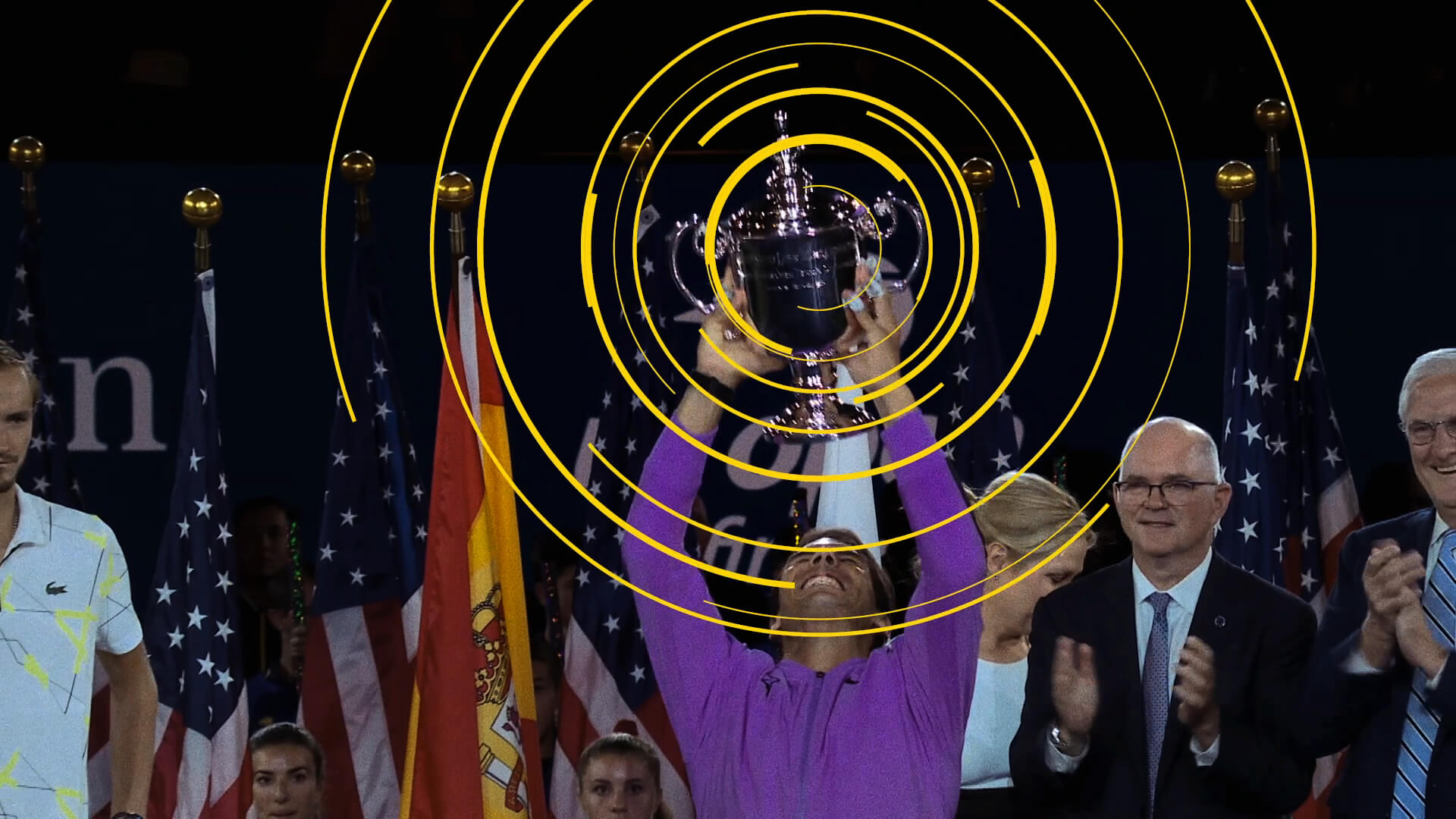
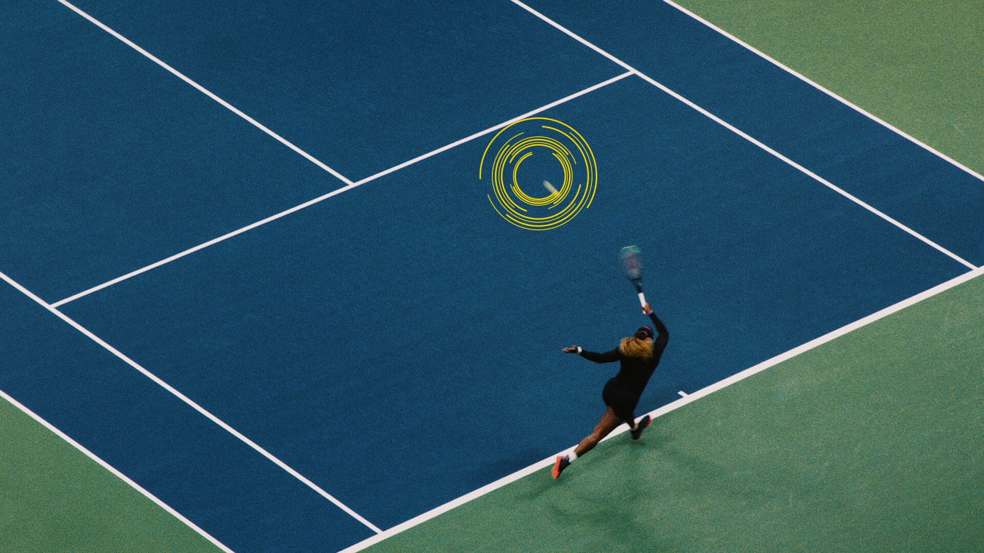
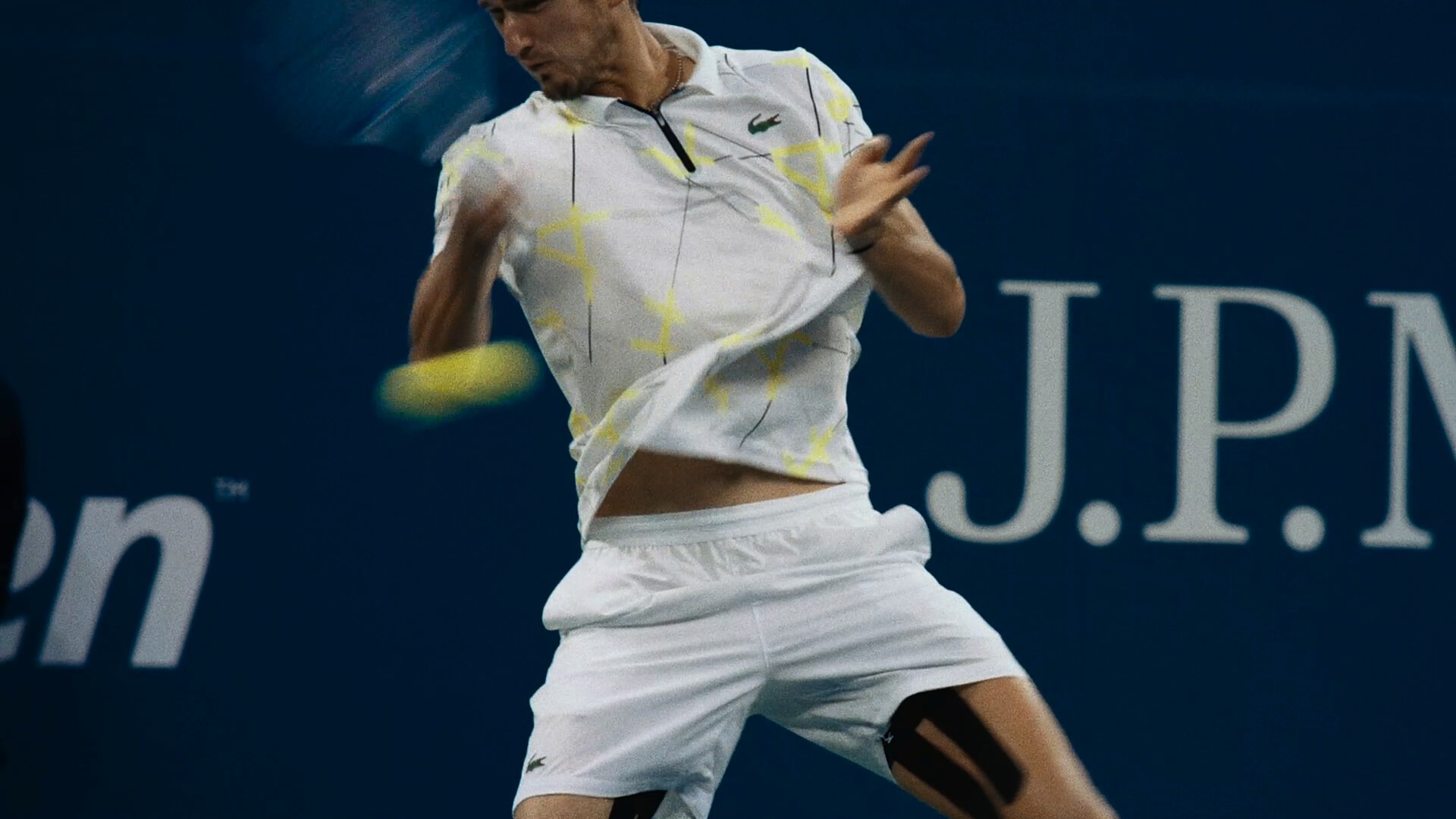
We used the physical action of the spot to motivate the trajectory of the graphics and type. The lines, type, and graphics move along with a player as they swing a tennis racket as if tracing the arc of their movement in midair. We track onto a player to have the animation feel more rooted within the spot and not get in the way of the beautiful footage. When they hit the ball the action then motivates our animated concentric circles and other secondary graphics emphasizing the dynamism and grace of their movements.