Treadstone USA
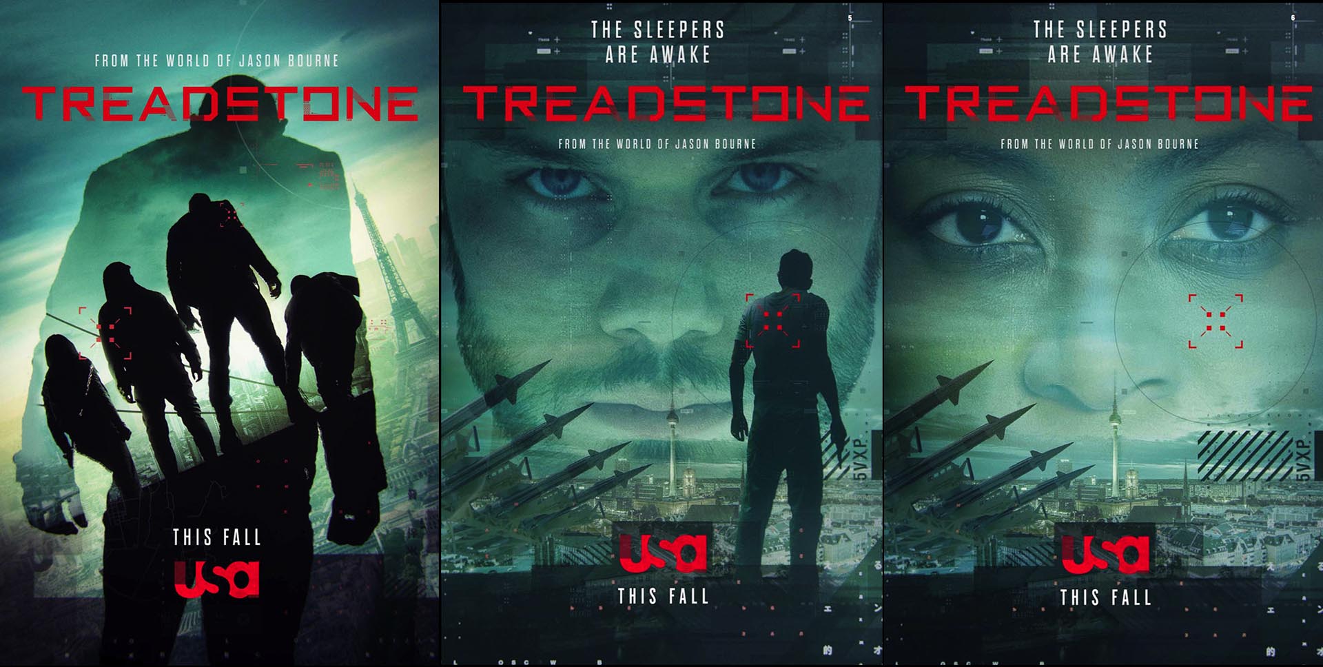
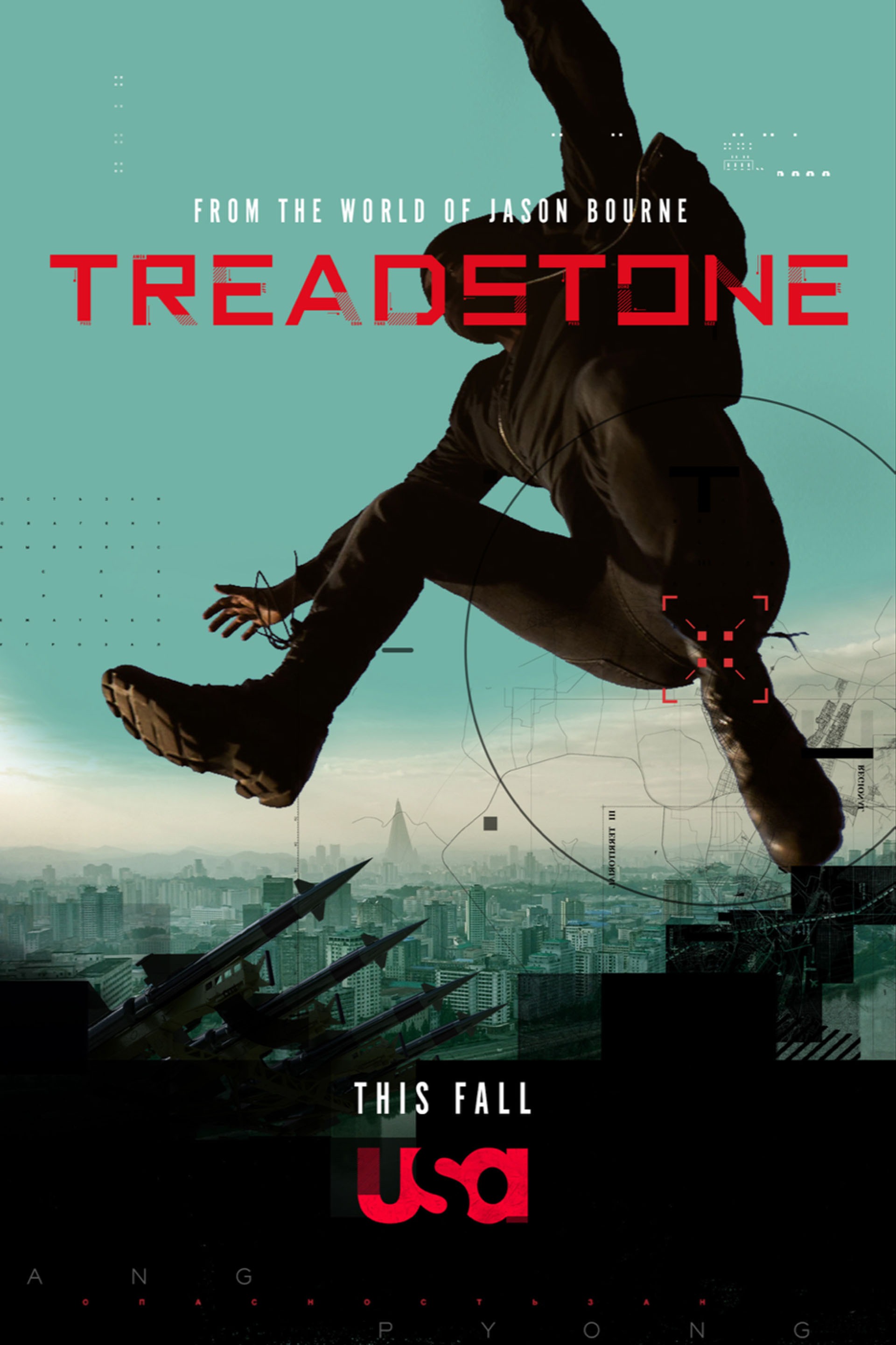
K+C recently created a full 360 design system spanning broadcast, print, OOH, digital and social for USA’s Treadstone. From early ideation through execution, the K+C team expertly toed a fine line linking the familiar DNA of the beloved Bourne franchise with the series’ exciting new take on the material. The design system comprised of three main components: custom font; primary and secondary design elements; and a custom footage and image bank.
The ‘Sizzle Reel’ above was created entirely from footage shot and directed by King and Country as part of the design system toolkit.
Social + Digital.
Different combinations of the toolkit allowed vendors to create unique designs across all platforms but remain in lockstep with the brand and creative. The graphic environment is a detailed tapestry that blends world maps and landscapes, geographic data, and deconstructed international typography. It’s a system that is sophisticated and global without ever being too heavy-handed.
Custom Tease Promos.
Long before a frame has been shot, we are often challenged with creating teases and content to start generating interest and building excitement for the show. With our design system already in place, we generated a set of teases created purely out of projection mapping and stock photography.
Custom Font.
For the package, K+C created a custom “Treadstone” font that takes it’s inspiration from warning graphics with custom slices carefully designed to enable each letter to have its own animation. Smaller acronym details give the feeling of codes and hidden messages within the letters. A simple script based UI was created for the design toolkit for animated digital and broadcast platforms, and an accompanying Truetype font was created for ease of use across all other platforms.

Print + Out of Home.
K+C directed and shot all assets needed for billboards, bus wraps and print in one-day on location by capturing stills and motion concurrently side-by-side. We shot a variety of action from unique and dramatic angles with an aesthetic that is slightly more graphic and composed than the shooting style of the show.

360 Design System.
The primary design elements draw inspiration from global cartography, infusing graphics with the notion of planning covert operations and global reconnaissance. K&C designed a set of custom maps based on international infrastructure, missile bases and military facilities that have geopolitical reference to locations in the show. Secondary design elements were created from multiple language letterform grids which reinforced the idea of global geography and international languages.
