The Continental : From the World of John Wick
K+C™ are excited to share their Main Title and Main On End for The Continental: From the World of John Wick a three-part, action-packed event which premiered on Peacock on Sept 22nd. Although the miniseries was born from the world of John Wick, K+C™ was tasked with creating something uniquely its own for the main title, subtitles and the main on end sequences focusing not just on the hotel, but on the many irreverent characters and plot lines that connect the dots of John Wick Lore. Over its three episodes, the main title unfolded along with the story, enriching the show’s world-building with unique hidden Easter eggs and cryptic clues that embodied the spirit of the night’s events. The fans quickly picked up on this, and within days were dissecting every scene.
The Continental explores the origin story behind the iconic hotel-for-assassins centerpiece of the John Wick universe, this time through the eyes and actions of a young Winston Scott as he’s dragged into the hell scape of 1970’s New York City. K+C™ was tapped by the show’s Director and Executive Producer Albert Hughes to get the team back together hot off their previous collaboration on ‘The Good Lord Bird’ which picked up the Emmy™ for ‘Outstanding Main Title Design.
The Character of Texture.
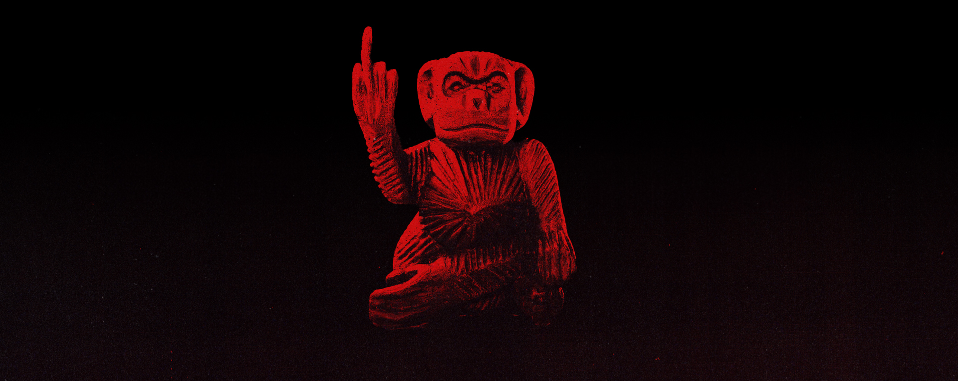
The Continental inherits such a rich and deeply involved world, so there was an incredible amount to draw from. Since the series is set in the 70s, we wanted to create a sequence that feels like it could have been produced using the analog technology available at the time—a fusion of illustration, high-contrast photography, and bold mondo design. We knew we wanted a gritty print look, but simply layering up grunge gets messy quickly and serves no purpose. Instead, we did an in-depth study of 70s Xerox band posters, taking cues from the grain, print marks and the patterns the xerox leaves while deconstructing the image. Using this method, we created a look that appears to be visually simple and tactile on the surface, but underneath enabled us to plan every shot in 3D and build in some sleight of hand to carry us from scene to scene.
Loaded with Unique Clues Each Night.
It’s crucial to keep the viewer engaged when transitioning to a main title from a recap or an opening scene, so each element was thoroughly examined and purposefully designed with this in mind. Although the lengths of our meticulous behind-the-scenes efforts may remain mostly unseen, we firmly believe that it shows in the finished product. We managed to create a title sequence that is both visually appealing to a general audience and filled with satisfying ‘Easter eggs ’for the dedicated fans with carefully chosen imagery that evokes an emotional response as the viewer is exposed, consciously and unconsciously, to the story beneath the story.
Shooting Human Puppets.
Every asset of the main title and credit sequence was created from scratch, including all the live action slow motion shoot-outs. K+C shot all the assassins falling on green screen with blue screen guns during a one day shoot. Instead of going the high-speed film route, we adopted more of a ‘human puppetry’ approach by suspending the actors mid-fall from rigs which allowed us to fine tune the performance and composition.
Building a Cohesive Look.
It was really exciting to have our fingerprints all over the show, from the main titles, title cards, subtitles, through to the end credits. In great John Wick fashion, we created a design system to add story telling value to the subtitles. They reacted to the actors performance and made great use of the negative space without ever stepping on the scene. For the end credits, we created unique backgrounds from the many elements we had designed for the Main title, enough shots so the credits would feel different each night. Using repetition and a more arrayed approach gave us the opportunity to reinvent how many of these elements could be used.
Inside the Treatment.
On the slideshow below are just a few of our other directions we presented during the initial pitch. We also shared board-a-matics against some rare 70’s B-sides which really helped dial in the tone. We pride ourselves on approaching these projects from very different angles always trying to redefine what a main title can achieve. Please reach out if you have any questions other than questions regarding the Easter eggs, those remain a closely guarded secret.
Behind the scenes.
Click below to take an in-depth look behind the scenes. The continental had many moving parts under the hood, from 2D motion design and 3D simulations to high speed, live action hit men. The overall aesthetic of the Continental allowed us to take a very ‘mixed media’ and multi disciplinary approach to production, yet still feel extremely cohesive in our final render.