The Good Lord Bird – Showtime.
Main Title
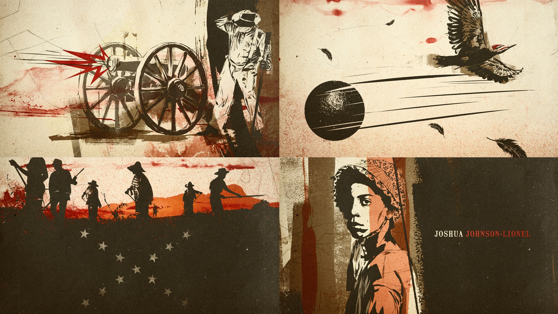
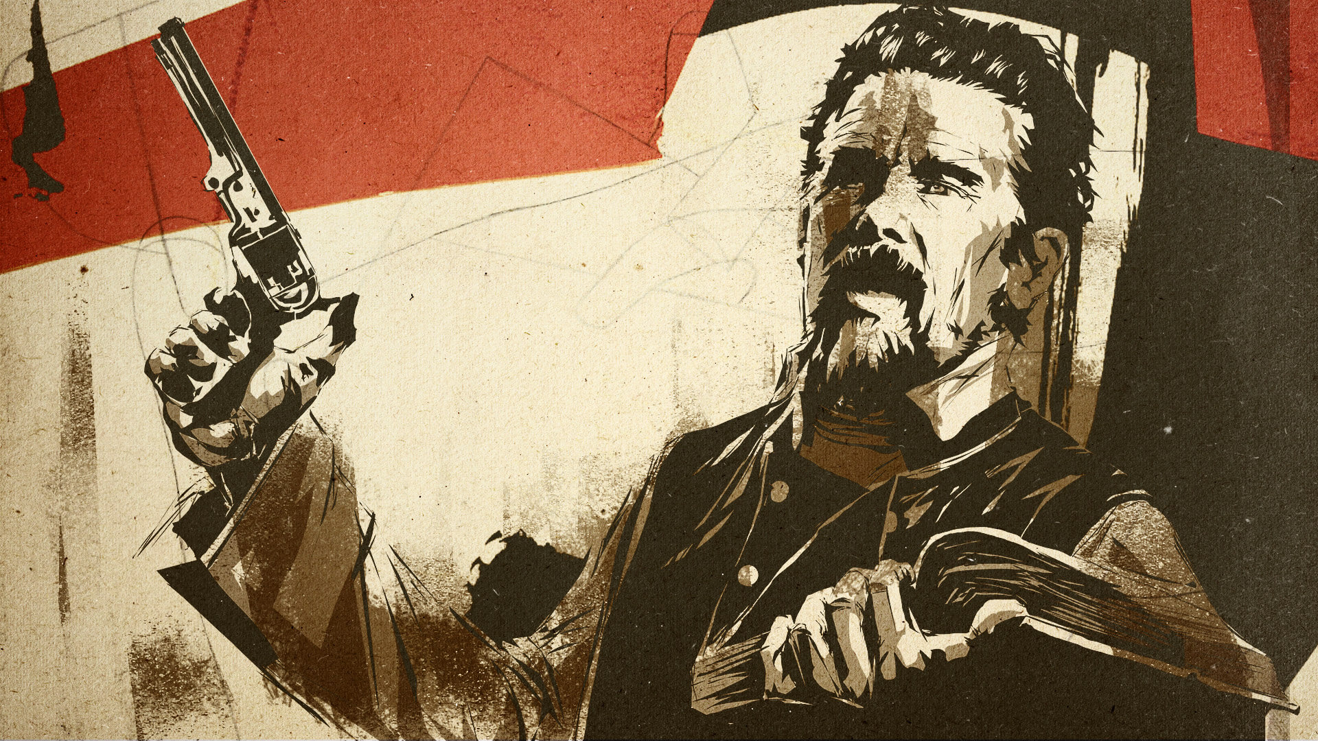
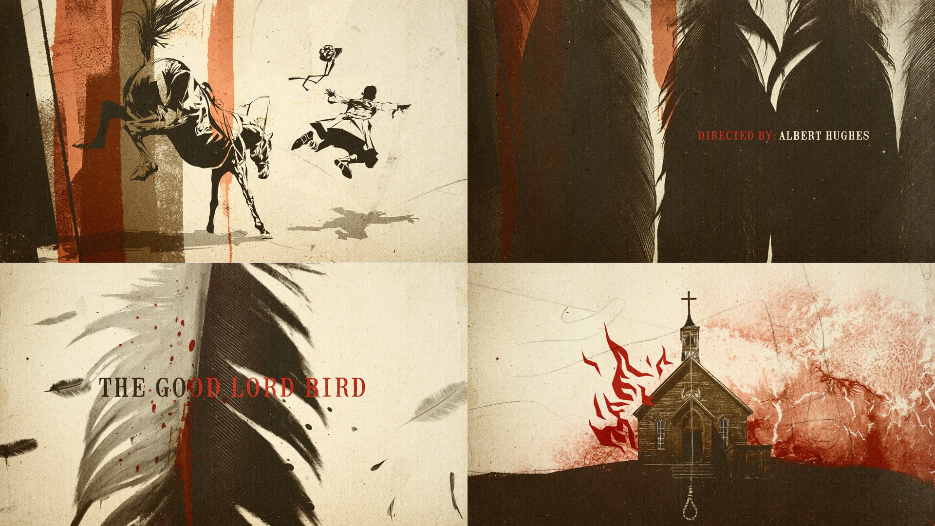
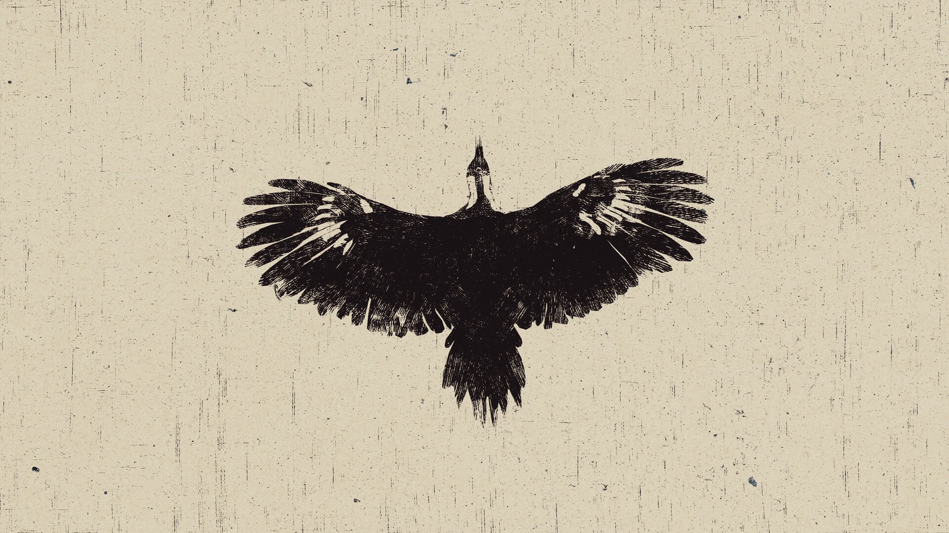
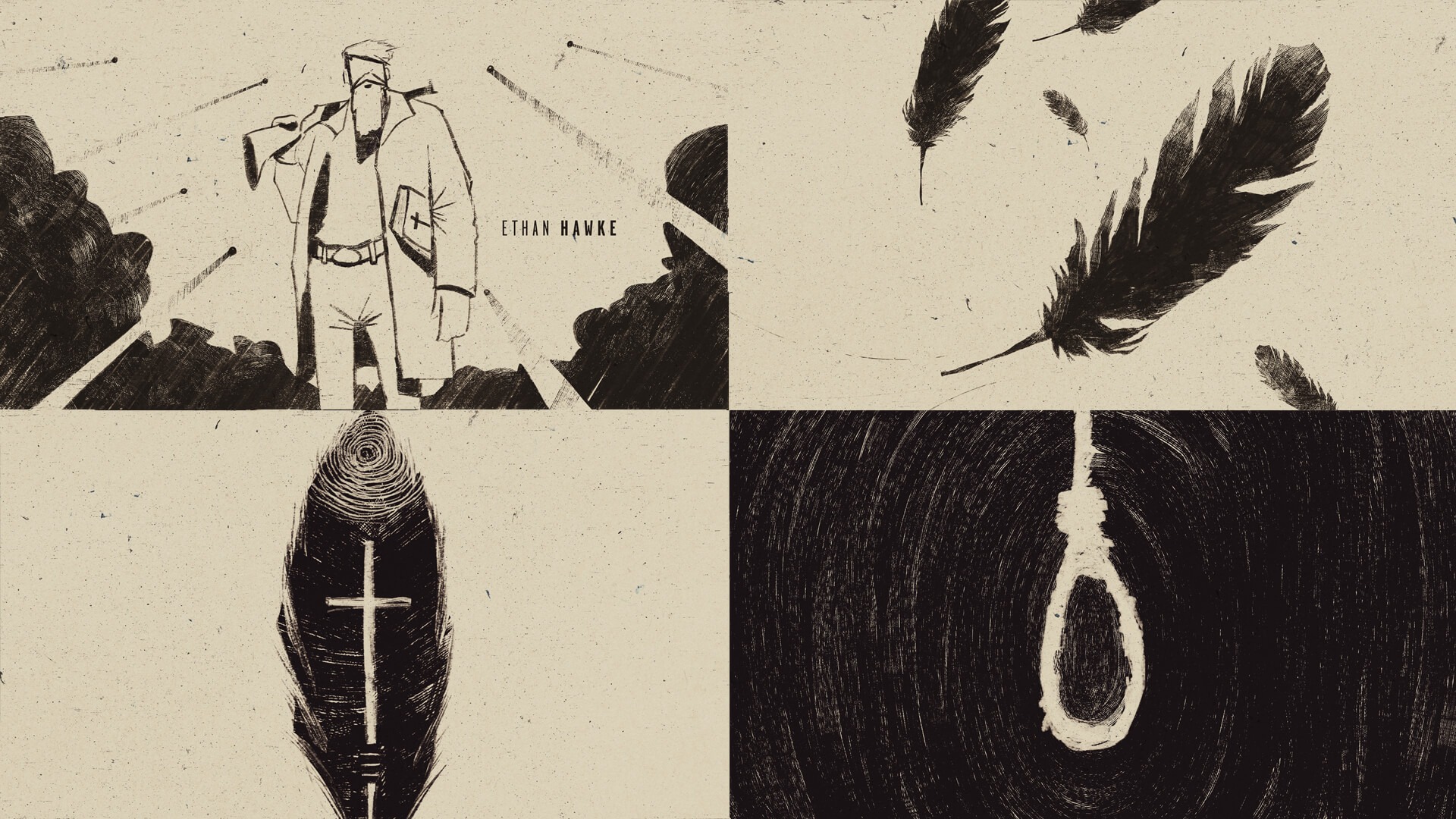
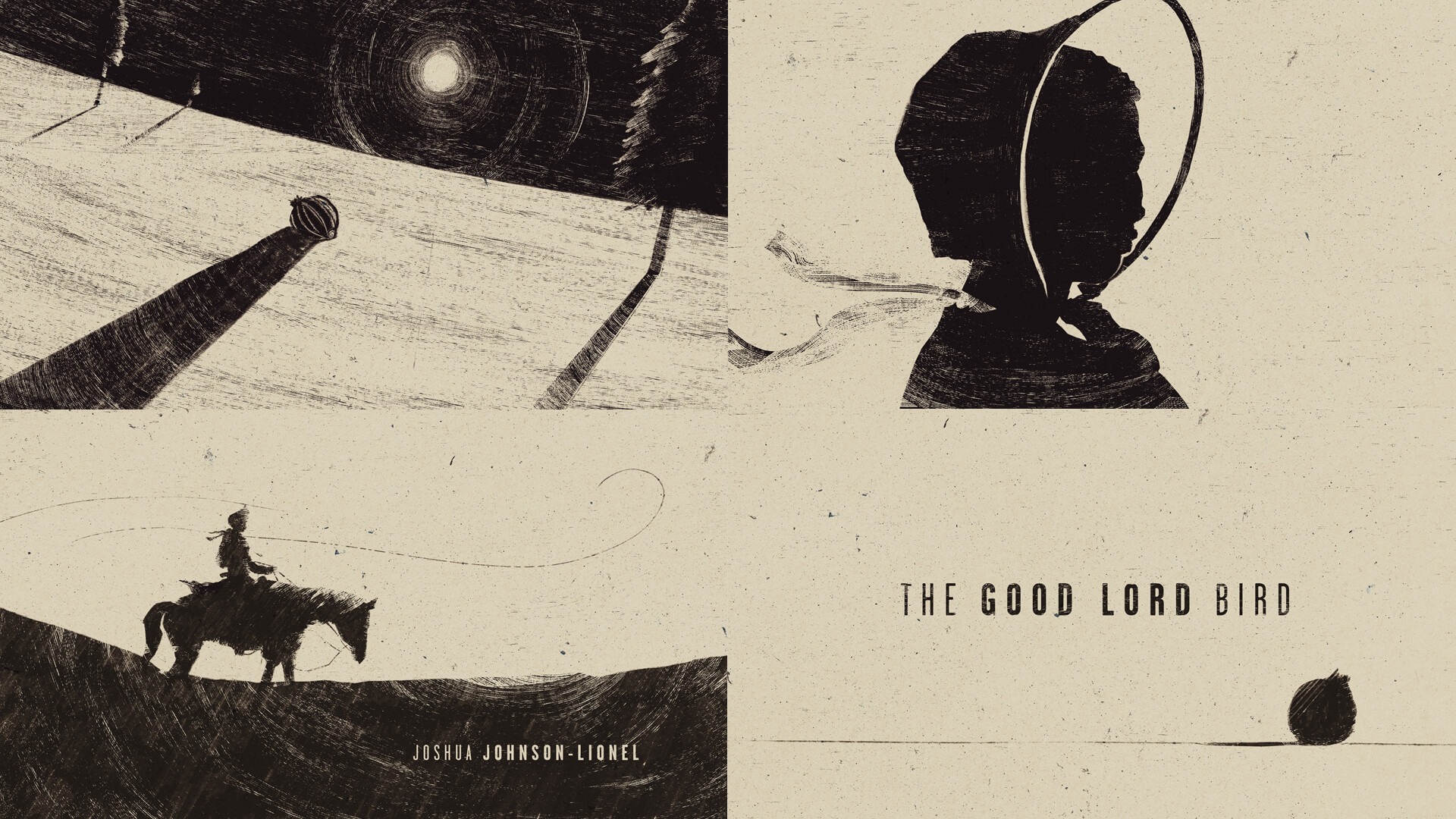
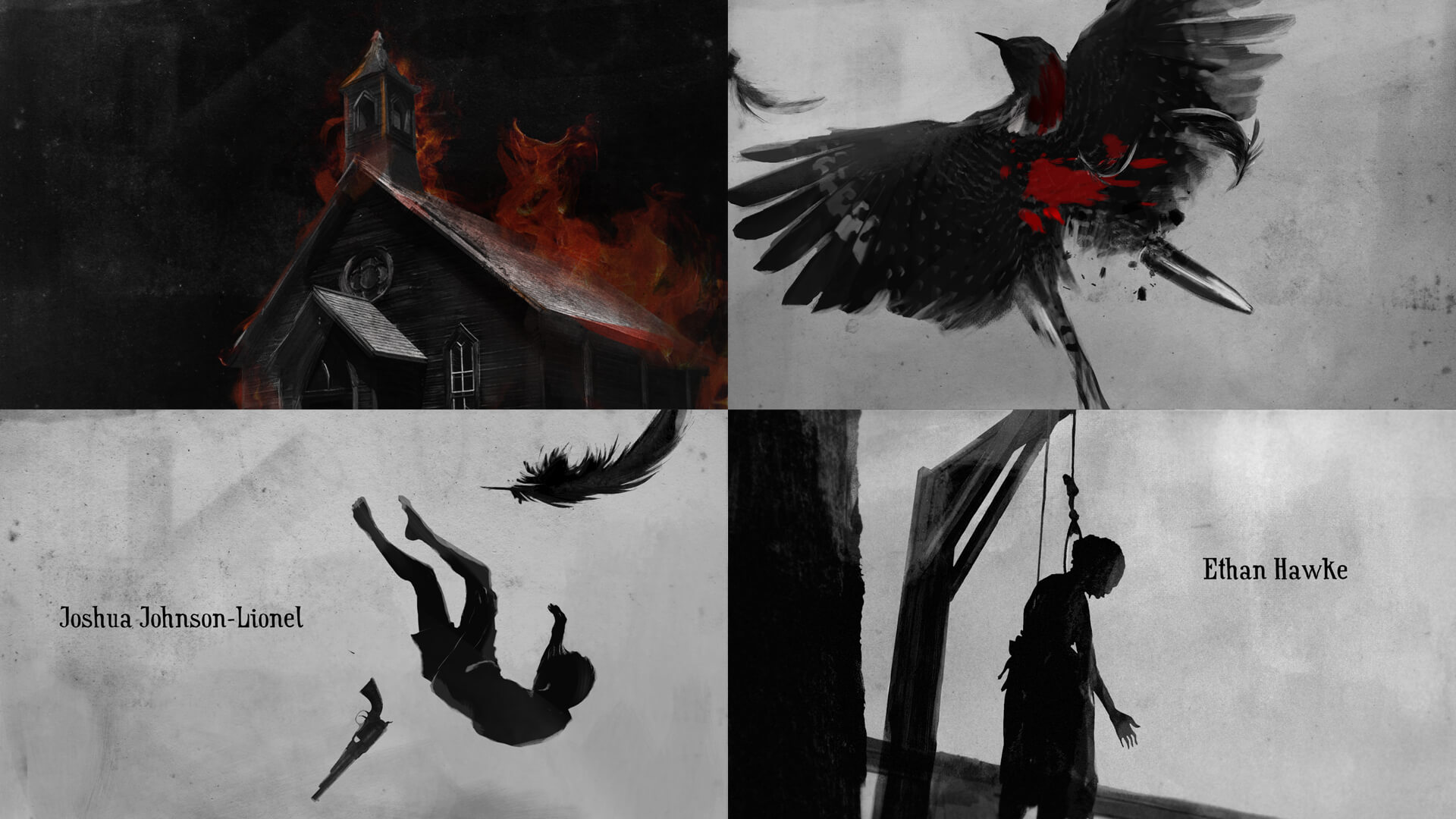
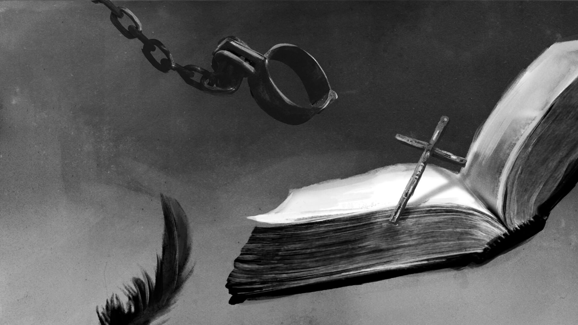
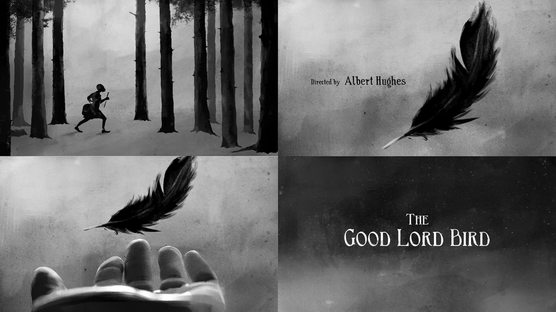
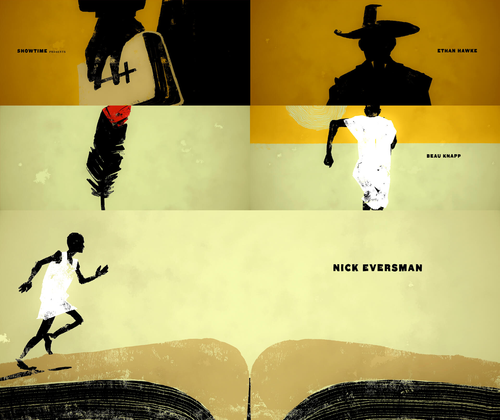
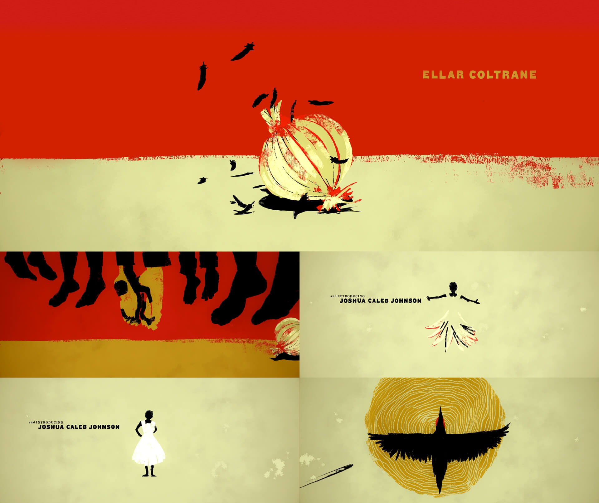
Our recent Emmy winning main title for The Good Lord Bird highlights the most pivotal scenes of the story, serving as a prologue that conveys the overall tone of the series. Quirkiness and absurdity amidst a dire setting, the titles are loaded with deep symbolism, and as the series plot moves forward, the meaning behind every vignette comes to life and ties to the whole story-arch.
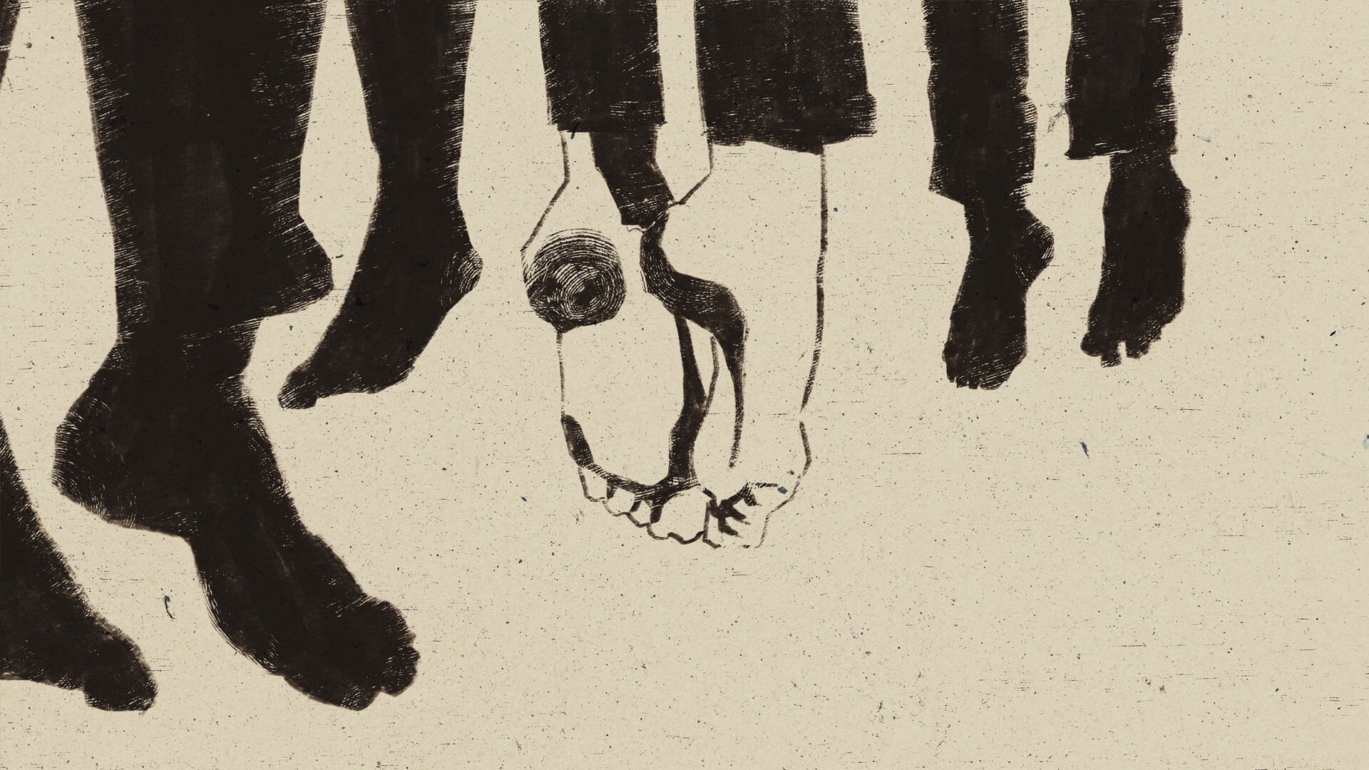
Henry’s character traits and personal circumstances drive us through the main titles. He is not an offensive fighter; instead, he rolls with the punches and manages a way to survive using the few tools he has. He’s slippery, managing to stay out of harm’s way with just the right amount of luck.
We employed minimalistic design with very gestural paint strokes and loose edges that help communicate the character’s seemingly dubious motivations and moral codes. We used Saul Bass, Jacob Lawrence, and Bill Traylor as graphic inspiration. Bold compositions and a coherent color palette that evolves from a hopeful start to a hellish ending, we explore themes of faith, superstition, and transformation, while allowing the audience permission to laugh through it all.
Storytelling & Setting the Tone.
Bill Traylor was an African-American self-taught artist born into slavery and spent the majority of his life after emancipation as a sharecropper. Our approach embraces Bill’s work and gives it a modern spin, matching the emotion and energy of his aesthetic with our own fresh visual style. Key story moments are not really revealed, instead, we leaned more into abstract concepts that establish tone, drawing the viewer in with expressive and affecting imagery.
Exploration.
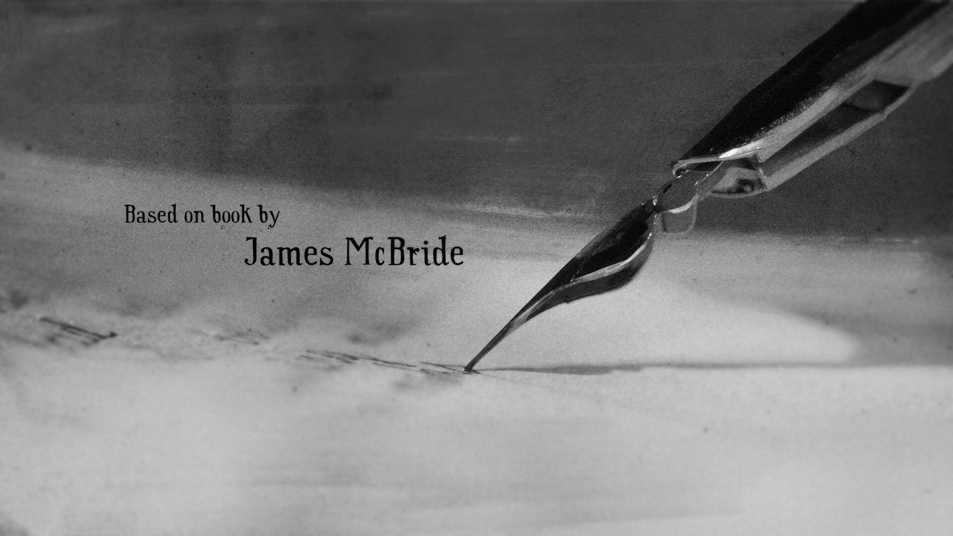
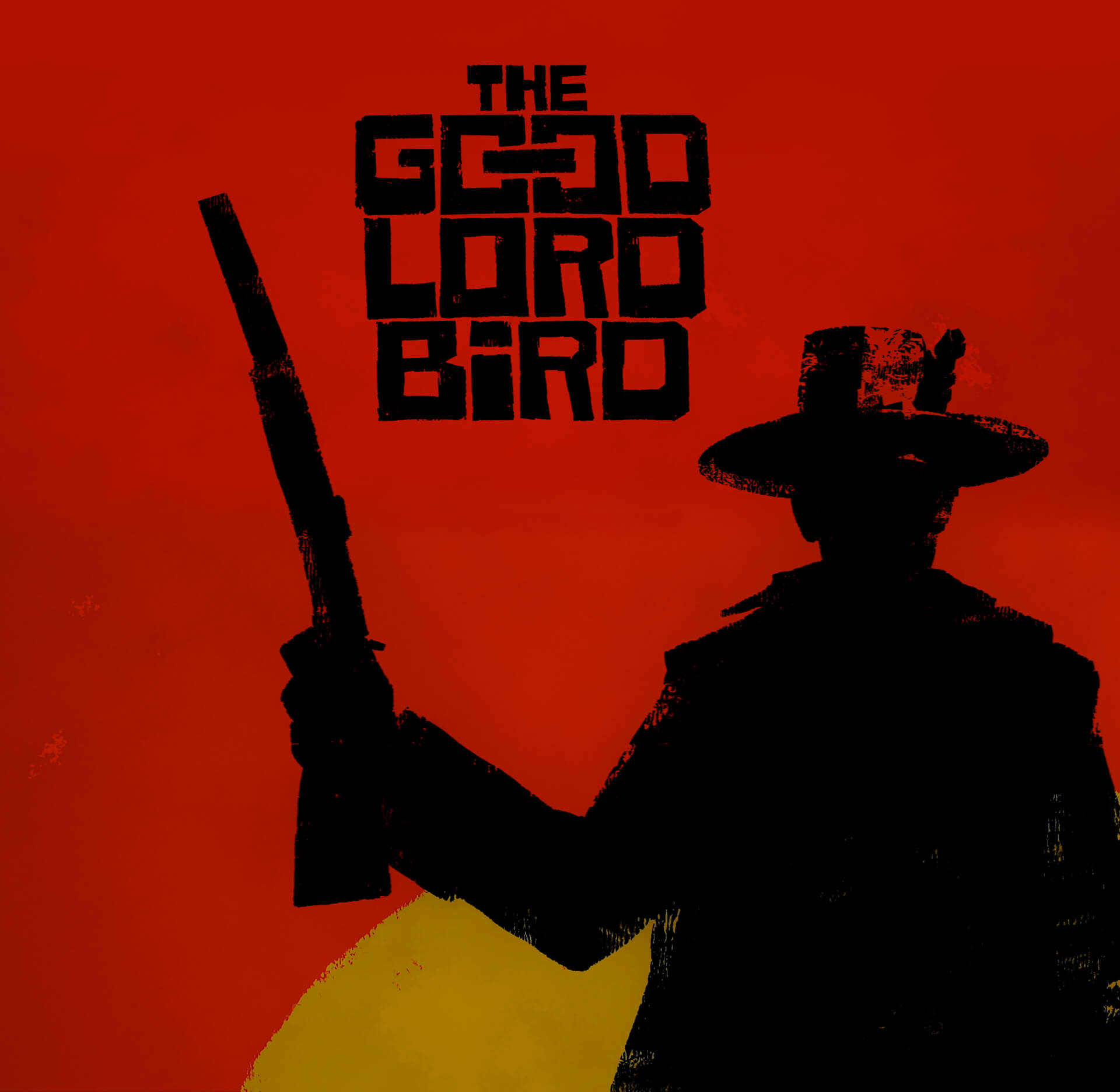
We always explore many directions when embarking on a project like this. Below is just a small sample of the many ideas we developed before arriving at the final concept.