Salt-N-Pepa Tease.
We were excited to get the band back together with our friends at Lifetime, especially for the purposes of getting THIS band back together! This is truly an epic celebration of one of the greatest musical acts in history, so naturally, it was deserving of an equally epic tease. With an authentically dramatic, high-energy combination of storytelling, graphics and sound design.
The Interplay of Light.
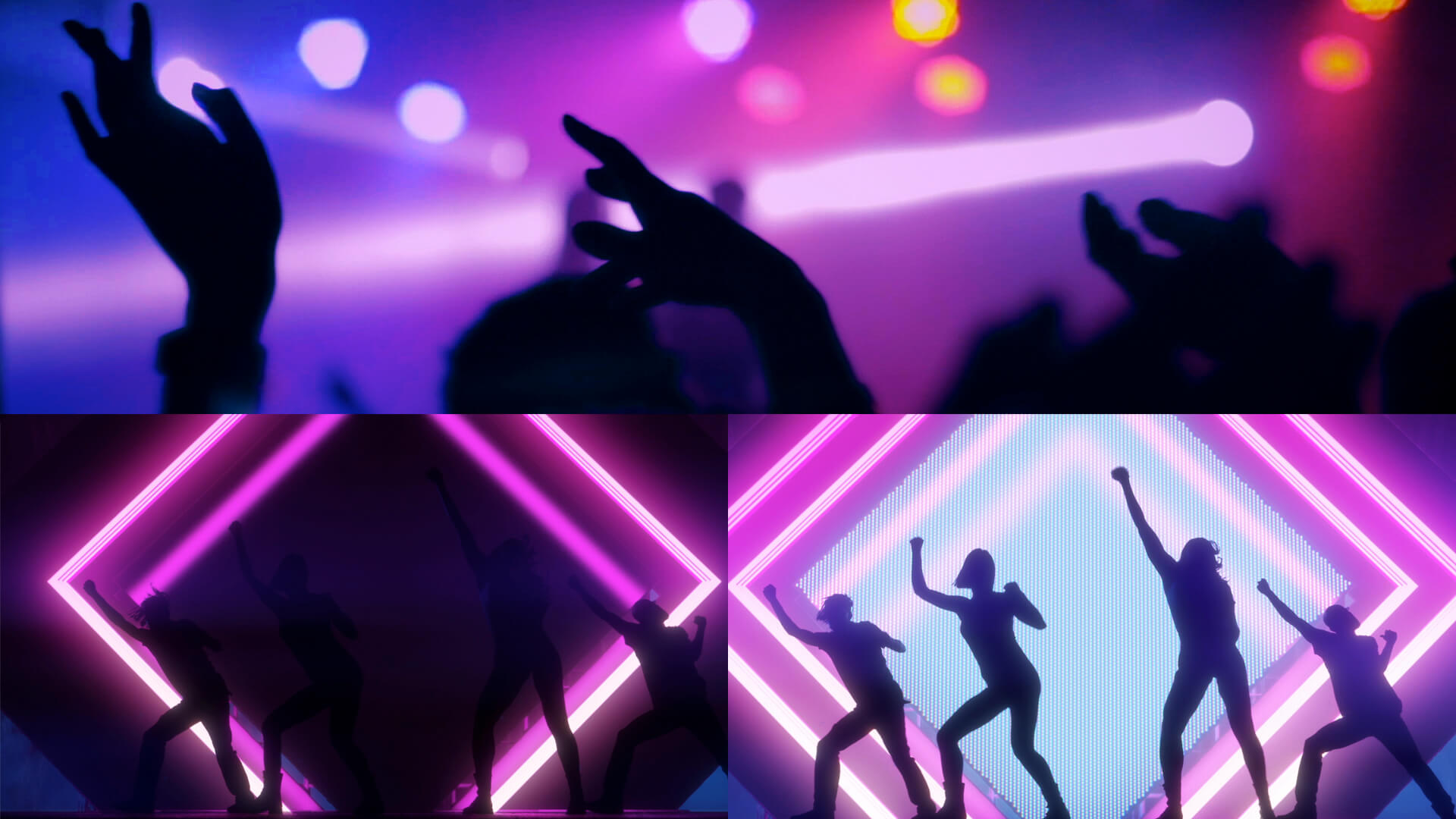
This spot is all about bringing the drama! Every element needs to work together to get our blood pumping and our hairs standing on end. With that in mind, we used the interplay of light and dark to slowly build the energy throughout the spot, amplifying the tension by quickening the pace of the edit as we build to a dynamic, punchy conclusion. The music and sound design also worked seamlessly with the rhythmic cutting to create a poetic rhythm overall, resulting in a pulsing, powerful, multi-sensory experience that gives us a tantalizing taste of that Salt-N-Pepa magic!


Design & Animation.
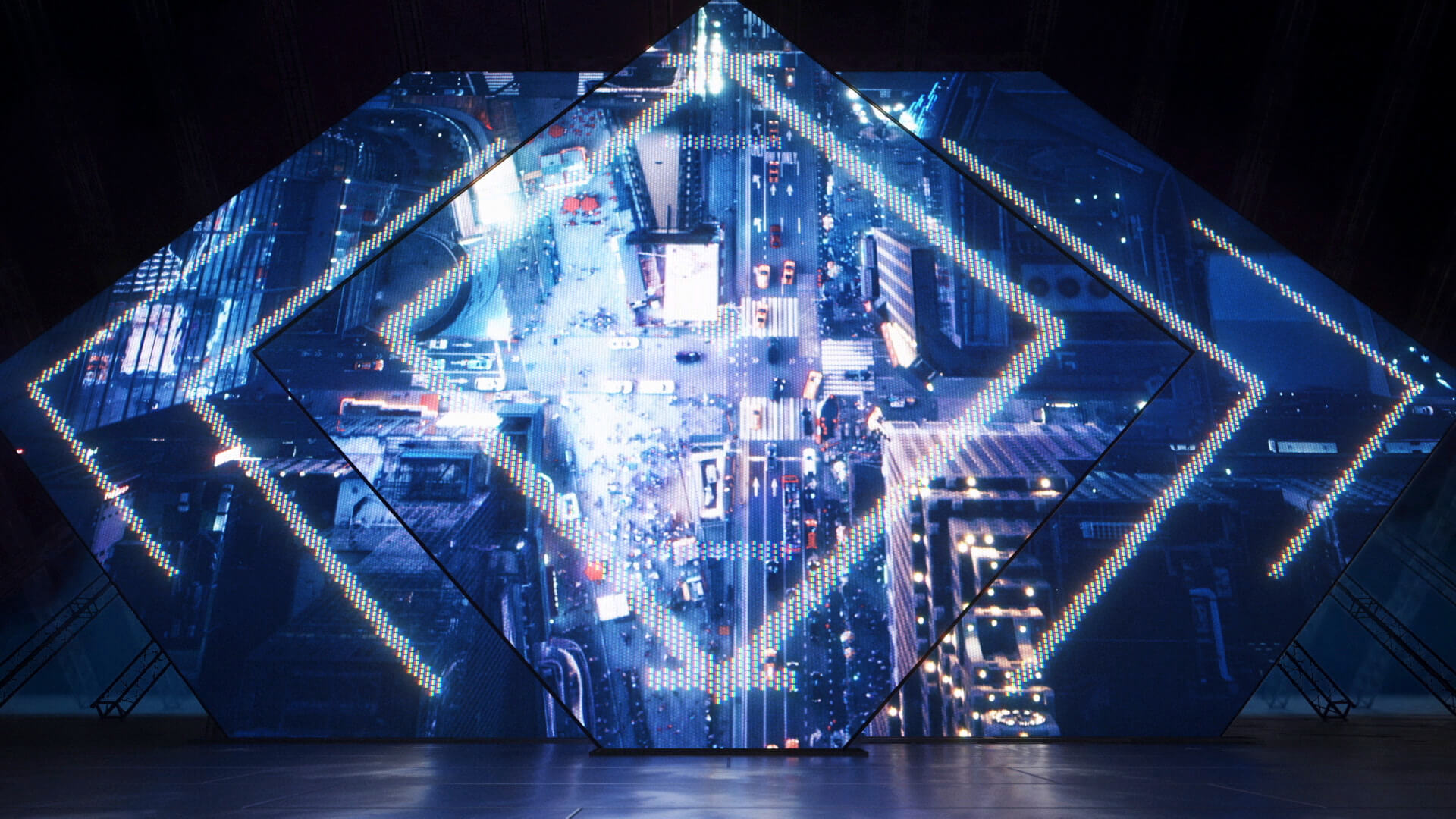
Our approach was a deft combination of outdoor marquees and arena stage design. We took the best components from both worlds, combining the use of neon, LED walls and marquee lighting. This opened up the opportunities for some great dramatic lighting changes and effects. This was a sly nod to the 80’s, but made refreshingly modern by the contemporary look of our design and animation.
Typography.
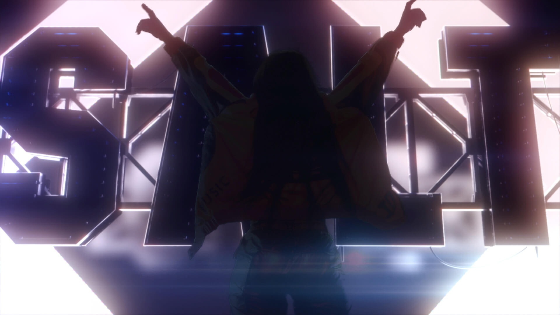
We drew our inspiration from a font that appears on the “A Salt With A Deadly Pepa” album. Its condensed letterform allowed us to create the monolithic size needed to fill the frame, and the secondary edges allowed us bring detail and fabrication elements to its construction.
Magic in the Details.
Structural elements, wiring clips and cables all lend a sense of realism to the imagery, heightening the drama throughout. Although most of this falls off into darkness, these subtle forms add a layer of reality that brings this all together.

