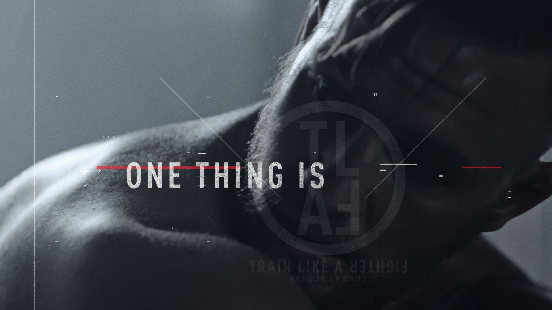
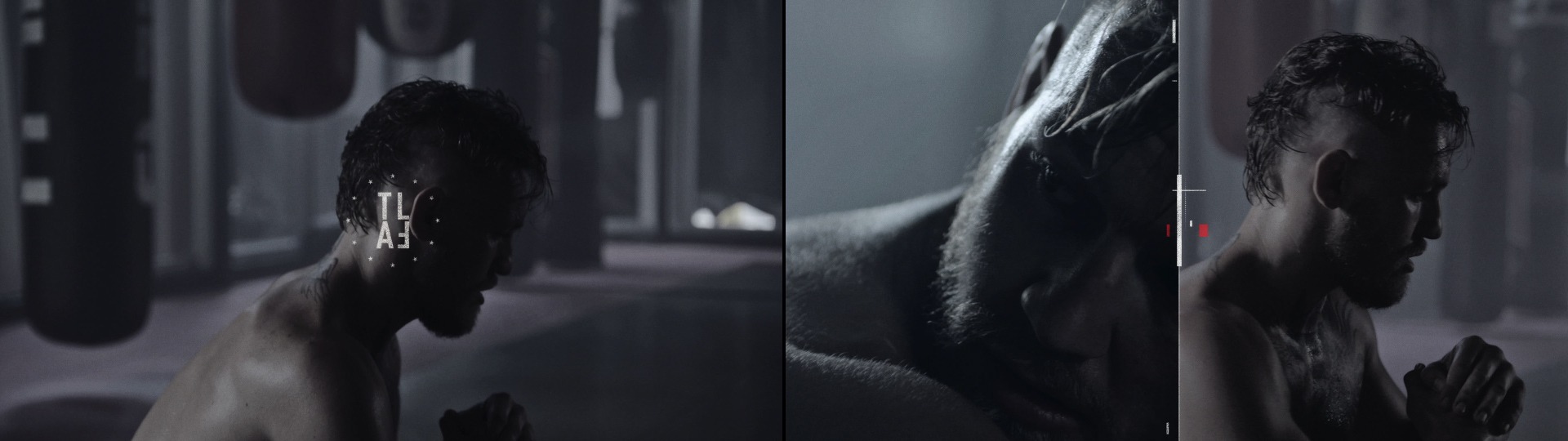
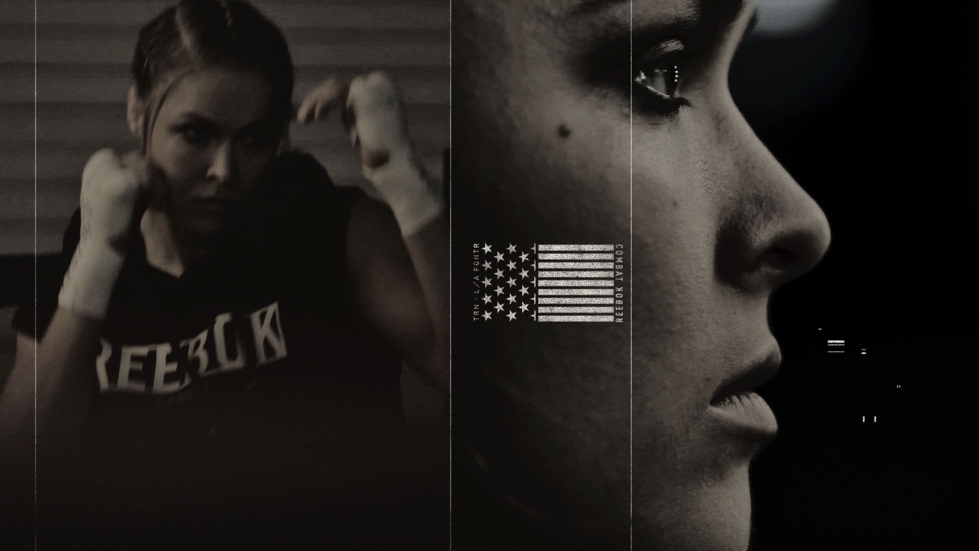
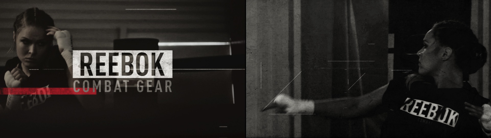
Typography That Kicks Ass!
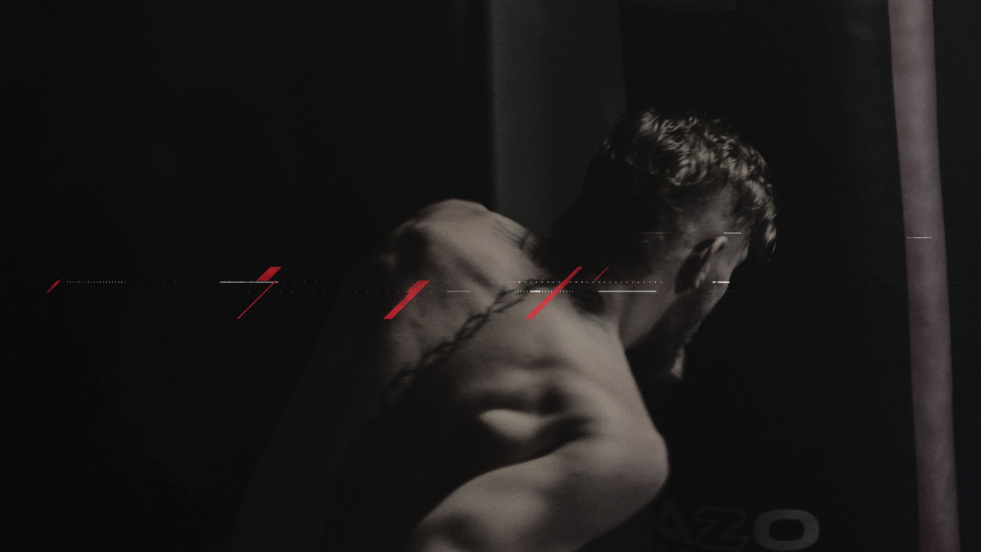
K+C used elements pulled directly from the product line coupled with fierce poses of Ronda and Conor to reinforce the own-able space Reebok’s new Combat line has garnered. Gritty and in-your-face typography coupled with ghosted or split-screen imagery of our fighter allowed us into the private training world of these two fighters. These unique graphic expressions become a language that enhances and defines the overall story to “Train Like A Fighter”.