
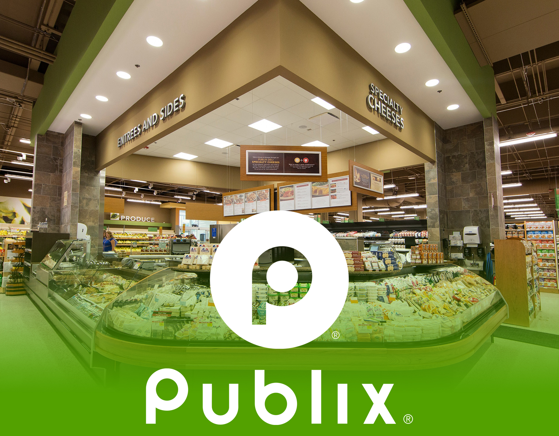
Publix In Motion.
We’ve spent twenty years teaching iconic logos how to move. Ford. Honda. Uber. Walmart. Zillow. PayPal. You learn quickly that the equity already lives in the mark. Your job is to unlock it, not override it. For Publix, we explored a complete motion system rooted in that philosophy. Not a single treatment. A living visual grammar the brand can speak fluently at any scale, across every platform and format.
From Static Mark to Living System.
Simplicity in a logo is often treated as something to protect. We treated it as an invitation. When a mark has few elements, every decision carries more weight, which means every parameter of motion becomes meaningful. How the logo enters a frame. The rate at which it resolves. The moment it holds still before releasing to the next beat. None of these are incidental. Together, they constitute a kind of second language the brand speaks before a single word appears on screen.
Exploration Through Motion.
We developed a wide range of animation studies, pushing the logo in different directions to understand its full range of expression. Some were bold and declarative, some slow and considered, some built on kinetic energy and others on restraint. The goal wasn’t to audition options until something passed. It was to map the full expressive range of the mark, so that whatever system we settled on would be built on genuine knowledge, not intuition alone.
Precision and Restraint.
The discipline of the work was knowing where to stop. Personality without precision becomes noise. Every motion decision was held against the same question: does this serve the mark, or does it distract from it? No distortion that breaks recognition. No movement that feels decorative or excessive. No expression that tips into gimmick. The motion is controlled, intentional, and disciplined , just enough to create connection, never enough to call attention to itself. The brandmark doesn’t clock in at the end of a video. It closes the argument. Every end card is a final impression, which means every animation of the mark has to be designed with the same intention as the work it’s ending. Playful when the work is playful. Restrained when the work demands it. Always unmistakably Publix.