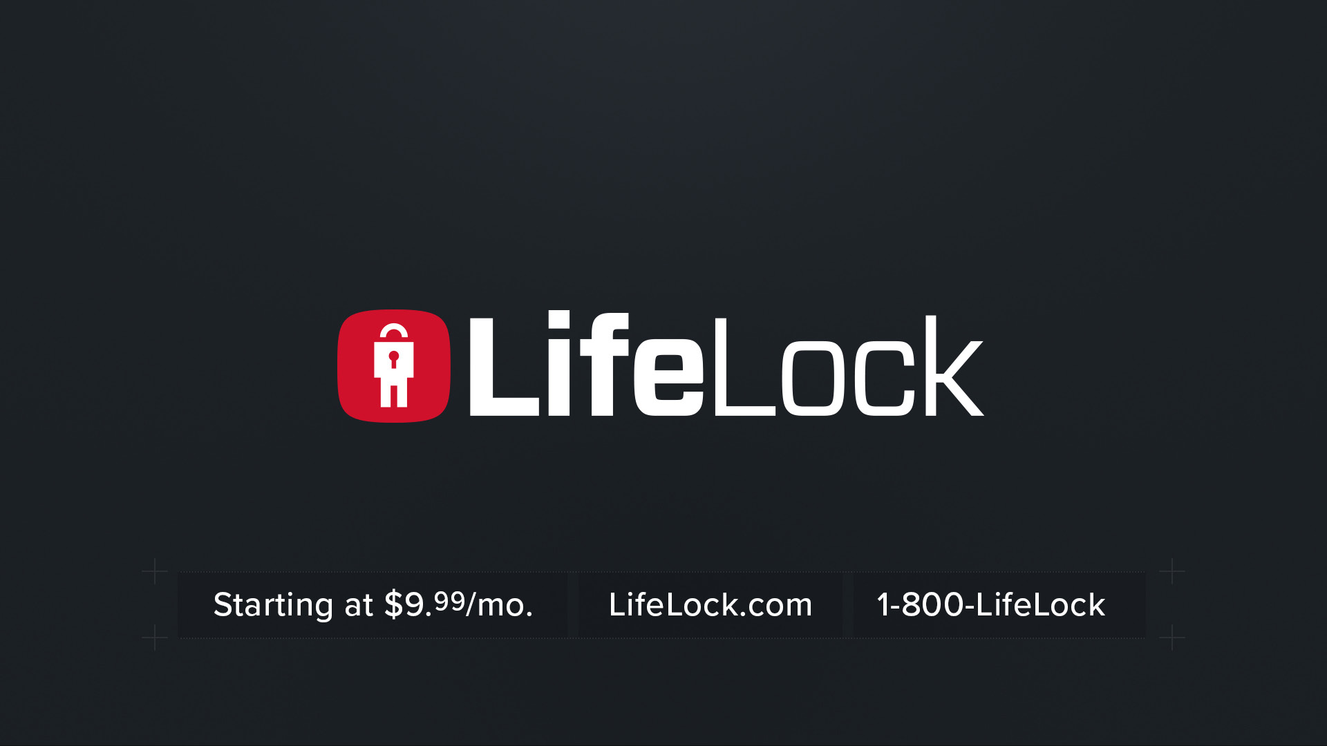
Lock it. Don’t Lose it!
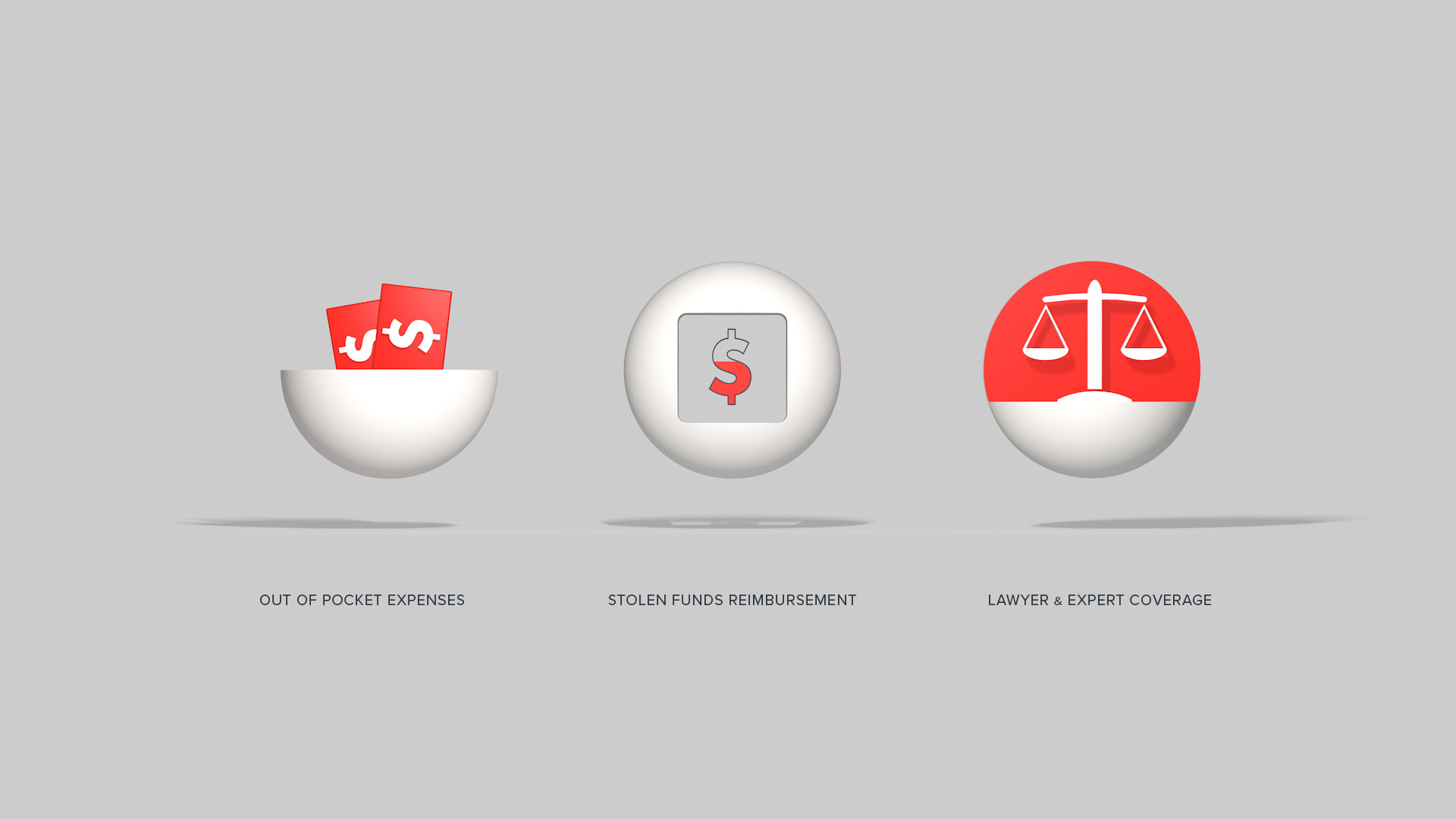
K+C was brought in early for logo explorations to rebrand the LifeLock brand. Our overall goals were to ensure the aesthetic truly represent the authentic, optimistic essence of the brand and the promise LifeLock represents. Our idea here was to use sleek and sophisticated graphics, but with a subtle sense of depth and dimension. The look is graceful and modern, resulting in a refined appearance that clearly conveyed the brand in a smart, friendly, confident way.