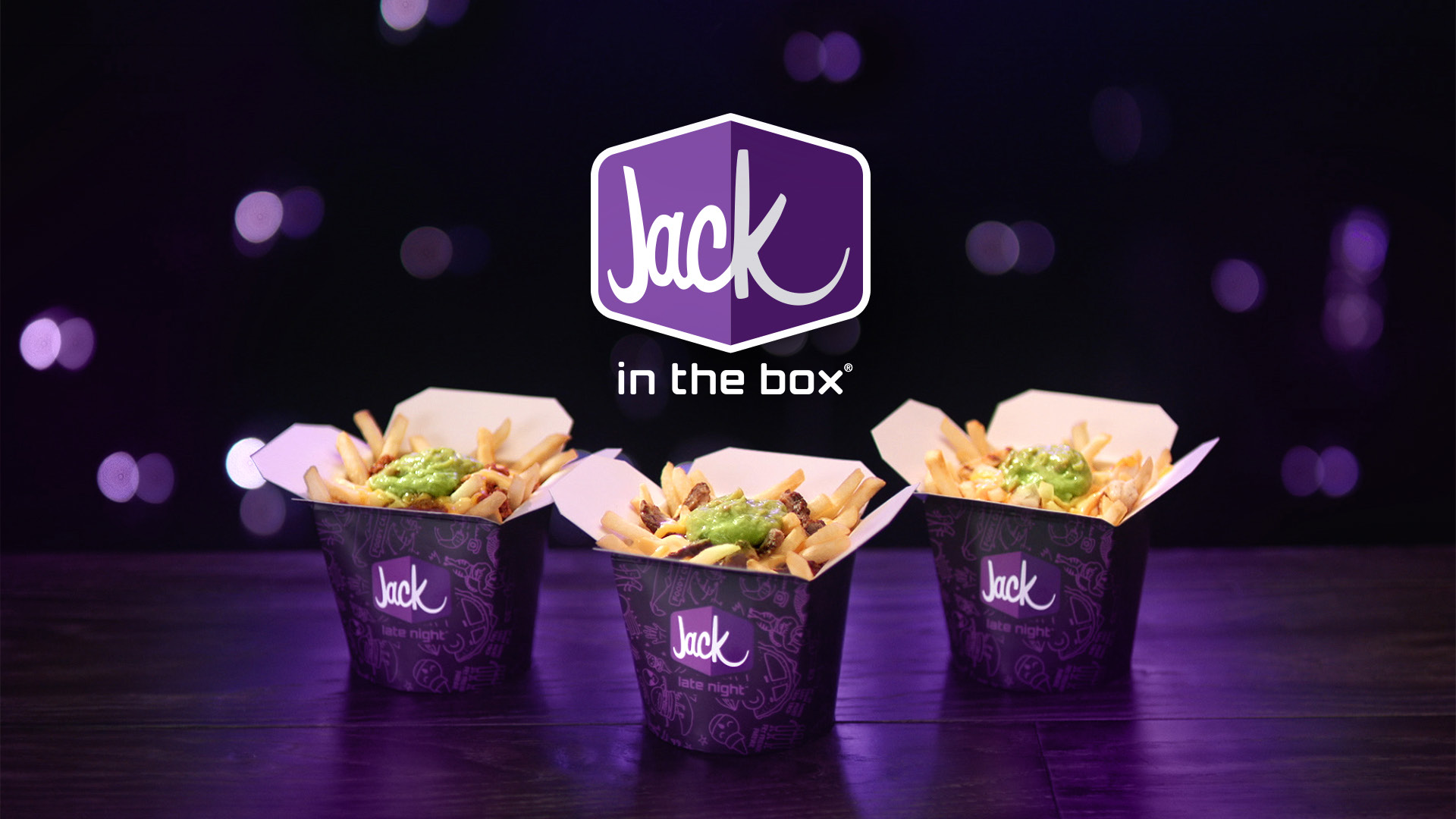
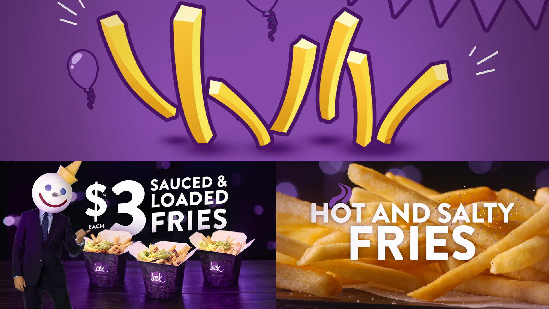
Sauced & Loaded Type!
With wall-to-wall beautiful food, in-your-face typography, and clever visual metaphors, K+C’s goal for this 7-month campaign was to reinforce Jack’s dry humor while adding a thick slice of energy and excitement on the side! Typography created the big, bold, and fun visual impact and while visual metaphors punctuate the unique attitude of the spots.

Socially Munchy.
Along with all the awesome sauce we put into the on-air campaign spots, nowadays there is just as much if not more emphasis placed on content for social elements. Our K+C team is well versed in everything online and digital and it really doesn’t matter what aspect ratio you require just let us know up front and we’ll figure it out just like we did for all of these spots.