Humana Dental.
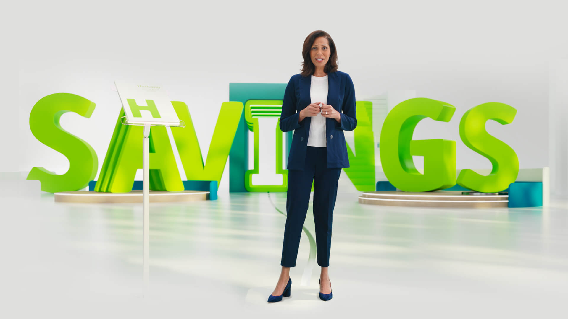
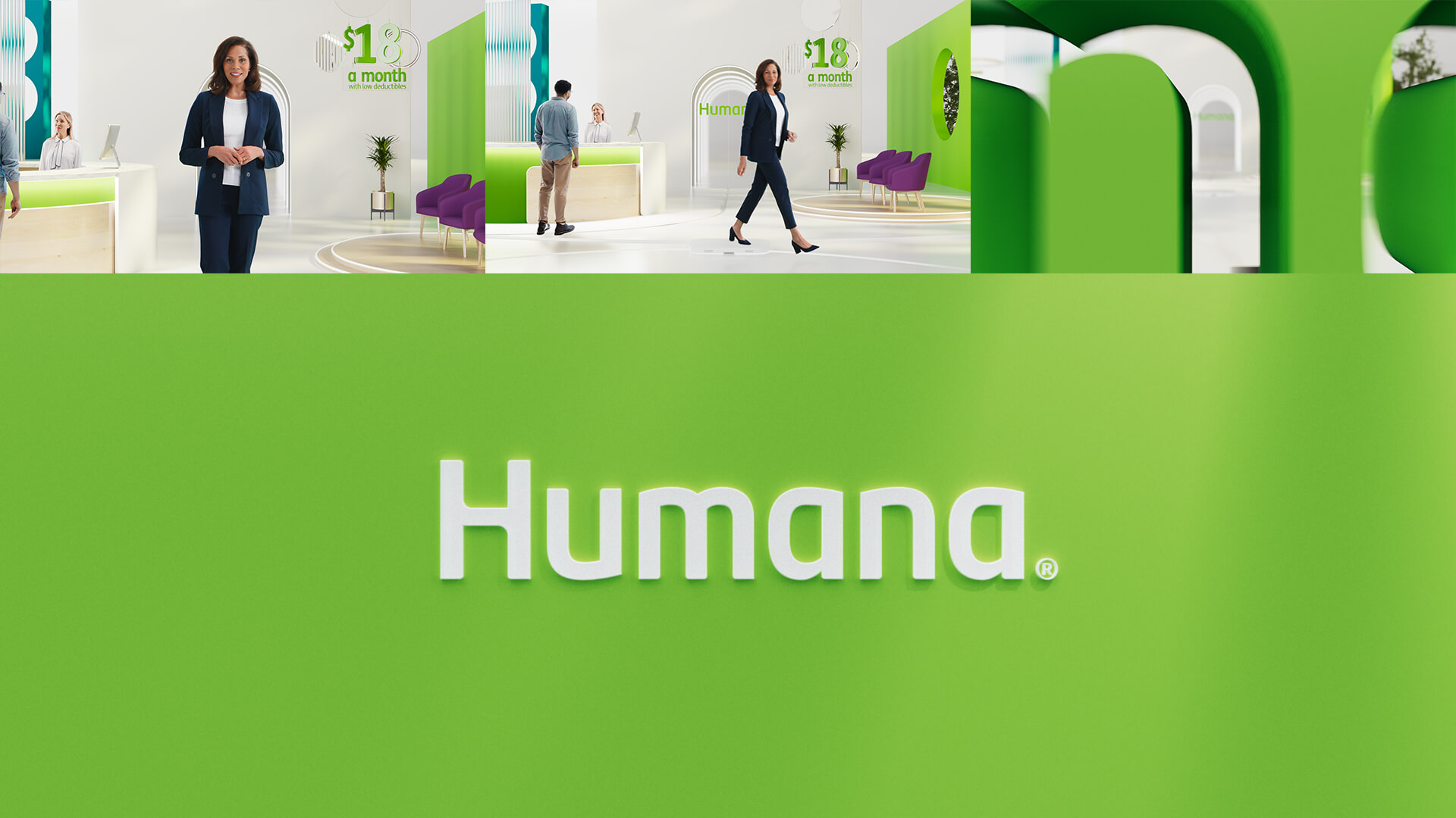
Collaborating with the wonderful Mike G and talented teams at Bodega, Rain and Humana, we were thrilled to create another captivating and informative spot, this time delving into the world of Humana Dental. Our team brainstormed ways to make this world feel expansive and immersive, while still keeping the production compact. With the majority of the spot being computer-generated, we had the freedom to use post-production animation to create a playful and charming aesthetic.

Micro Sets.
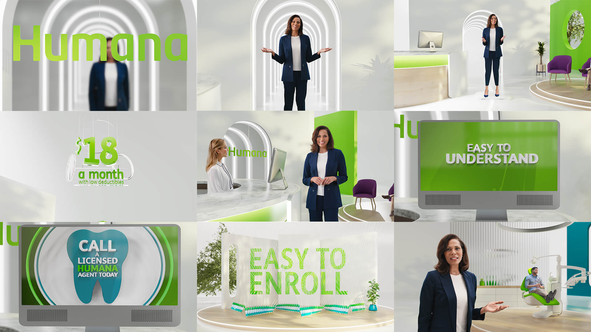
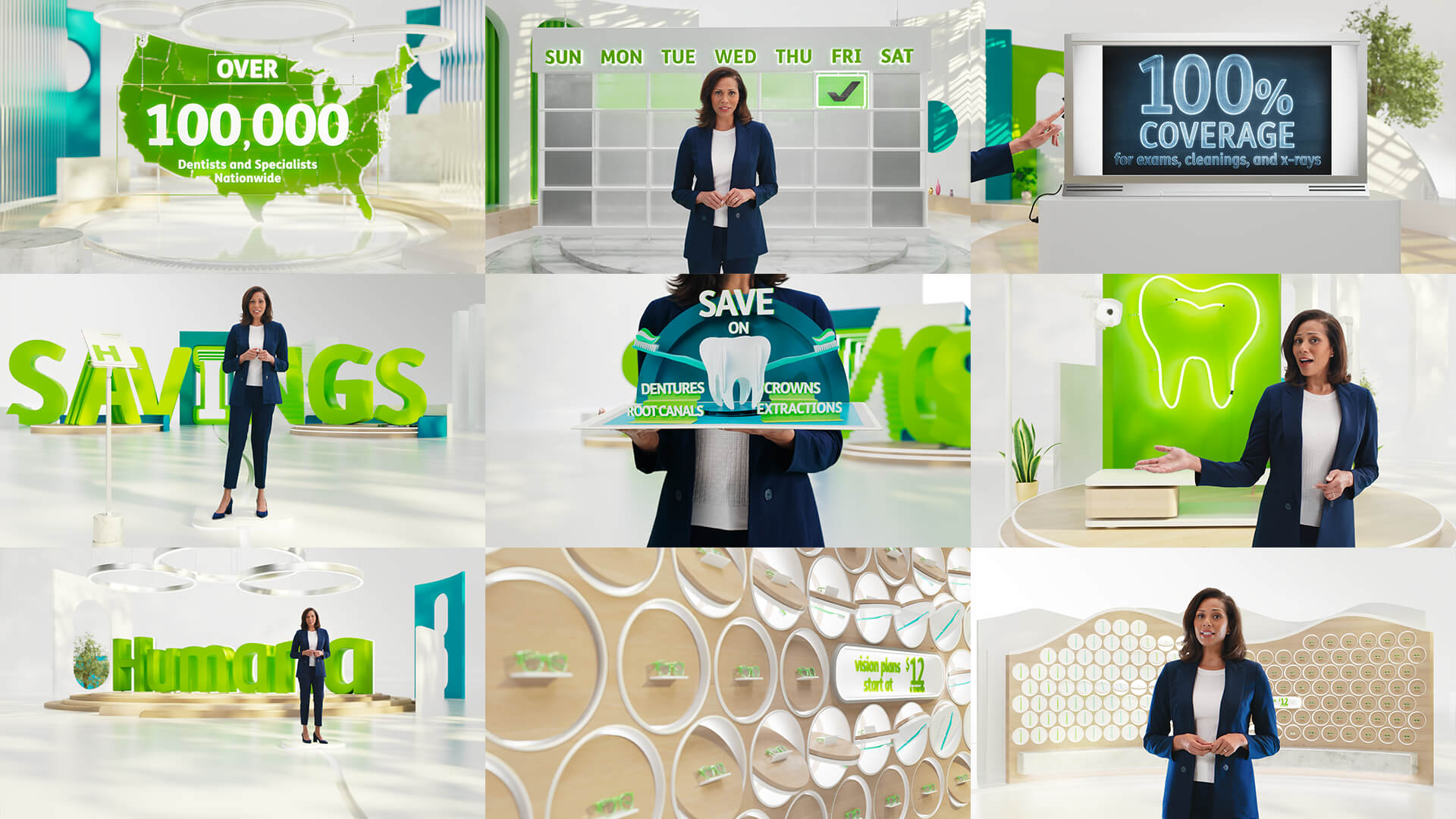
One of our standout concepts was Mike’s idea of transporting our host through the world on a small platform, allowing her to move in any direction while the camera remained fixed on her. We crafted a collection of intricate micro-sets for her to explore, including dental offices, installation art, and even a pop-up book that opened to reveal a smaller captivating world. During these moments, we employed full CG animation to showcase dynamic visual elements and once that segment was complete, we seamlessly transitioned back to our host and continued to the next micro-set.
Design Style.
Our design approach blended retro-modern Scandinavian styles with a minimalist, polished aesthetic. We utilized an array of mixed shapes throughout the architecture and design, incorporating arches, rounded shapes, and angular elements to define spaces through the clever use of light and shadow, as well as color.
Process.
In terms of our production process, we started post-production early on, roughing out the design of the spaces and gags. As the project progressed, we were able to evolve and refine the previz (pre-visualization) into the final piece. Our team even reviewed and approved a full three-minute spot with a temporary host image and scratch VO before shooting even began. This allowed us to have a solid foundation for the final product, and the previz seamlessly evolved and integrated the actual footage of our host as we polished it up to become the final spot.


