Advance Auto Parts
Design System.
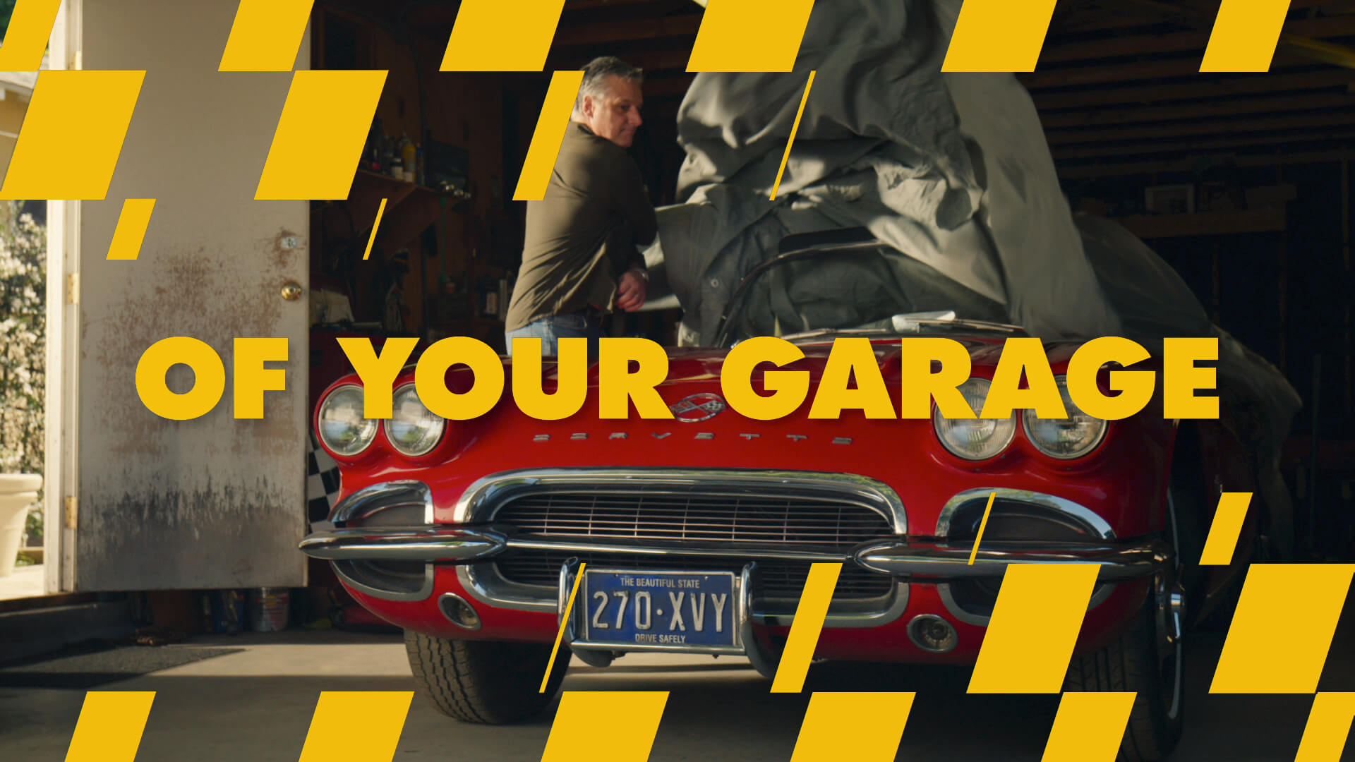
K+C recently created a full 360 design system for Advance Auto Parts. We put a lot of thought into creating the manifestos for our design toolkits, and we were excited to create something unique and own-able: a toolkit that was purposefully designed to facilitate both eye-catching visuals and strategic branding. With this toolkit in place, we created a typographic-led campaign that captures viewers’ attention while pushing the brand forward. Clear, compelling, visually bold type that can garner recognition over time and become an iconic part of the brand’s voice.
Forward Thinking.
The idea was to keep this looking fresh far into the future, with a system that can gradually expand over time. To that end, we designed a toolkit with optimal versatility in mind. All the magic was put into the way we animate in and out, ensuring the messaging rings out loud and clear without ever overshadowing the imagery. Our elements are nimble enough to accommodate fast changes and were purposefully designed to work well in both GM and Hispanic markets.
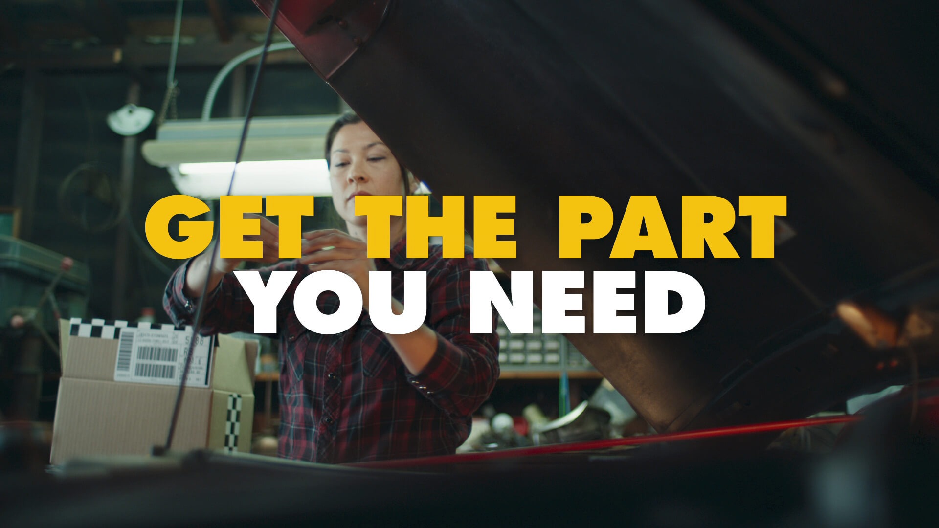
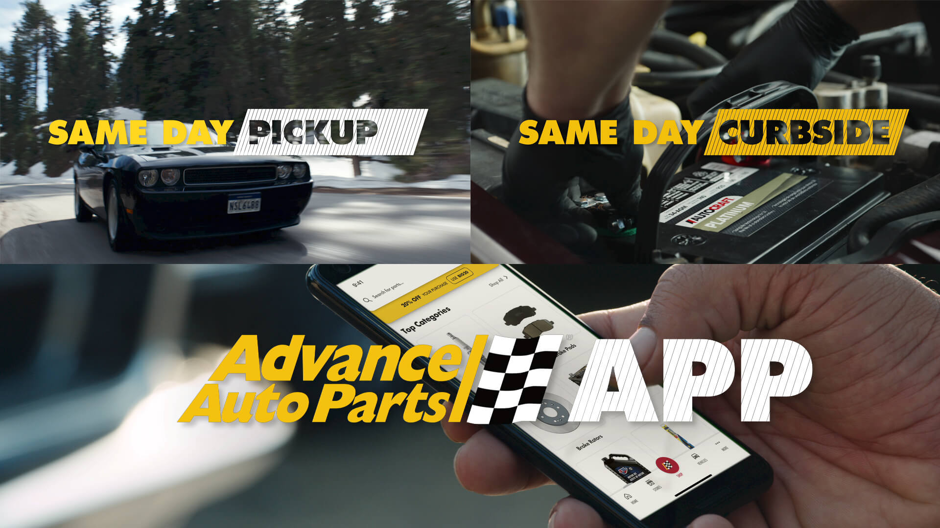
Branded Typography.
We built out from the forward slash (found in the logo) to reveal and remove words, changing the intention of the message whenever necessary. Other times we used the device to help motivate an edit, split a screen, or even create a wipe. We also used it repeatedly to create a pattern inside our type, which added texture and movement while also serving as a clever reveal or wipe off. Used as a grid, it enabled us to add smaller tech-looking details, giving our toolkit and graphics a modern edge and bringing definition to our frame.
The Checkered Flag.
We used this element to flutter across and down the frame, both as a graphic element and a strong branding signifier. Similar to the forward slash, we could replicate scaled-down shapes derived from this pattern to create a tech grid—another strong branding element which imparts eye-catching definition and detail.