A Coke with a Twist.
For the third consecutive year, Coca-Cola Southwest Beverages, a company of Arca Continental (CCSWB) returns with a regional spot on the Super Bowl. This year’s spot promotes CCSWB’s dedication to fostering a vibrant and engaging culture that proudly supports the communities where it operates through a playful narrative. K+C™ was tapped to produce, design and direct ‘Box Art’ by Dallas based Plot Twist Creativity, which brings the Coca-Cola product range to life with stop frame animation and invites the audience into a world that is instantly familiar yet grows fantastically surreal. A seamless blend of the whimsical growing from the ordinary. Creativity and fun built from simple materials.


A Celebration of Creativity and Community.
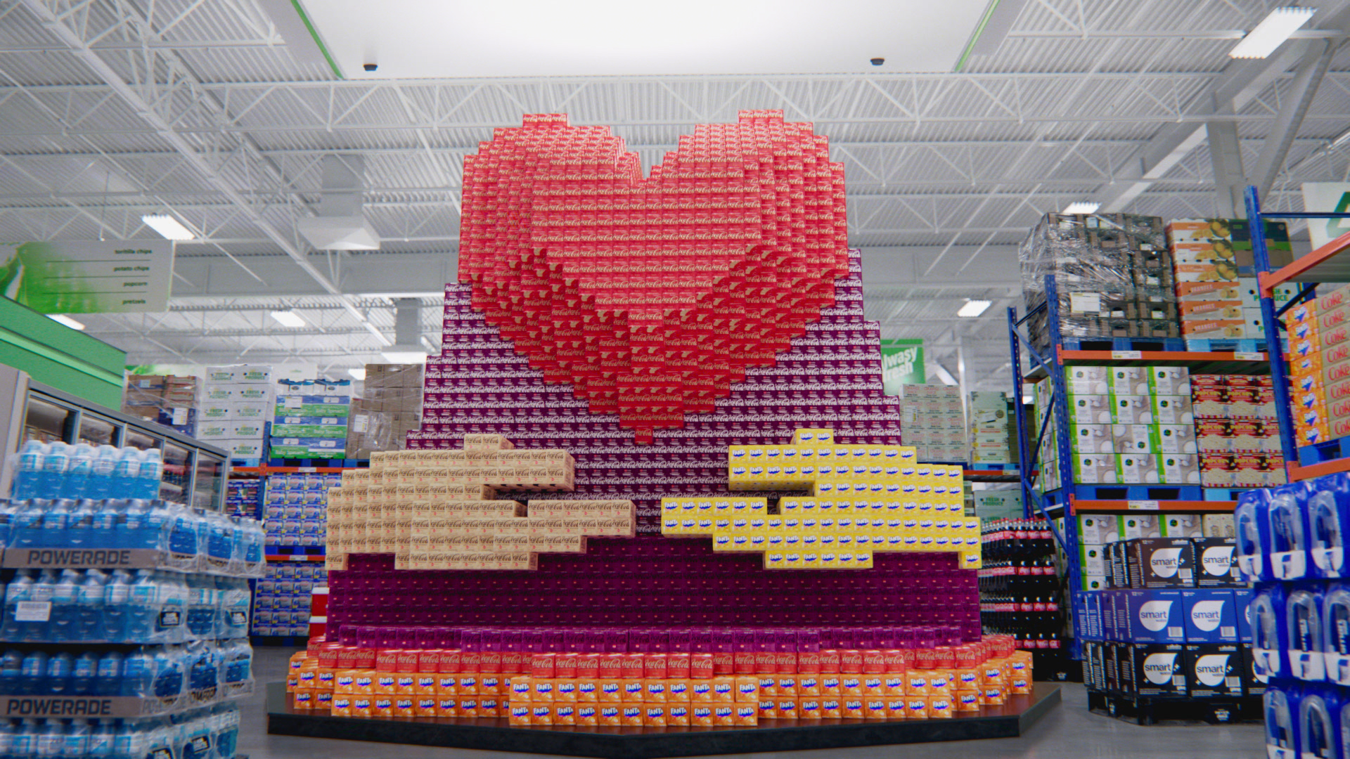
In a world saturated with digital media, Box Art stands out by embracing the tangible artistry of stop-motion animation, reimagined through the vibrant lens of pixel art. We crafted a narrative that unfolds on an epic canvas, using hundreds of CG Coca-Cola product boxes as our pixels, each one contributing to a larger story.
Our approach was grounded in the meticulous art of stop-frame, where every frame is a testament to the effort and precision that defines the medium. With a nod to the heritage of Coca-Cola, we journey through scenes that evoke nostalgia, joy, and the unmistakable fizz of our favorite beverage and celebrate Coca-Cola’s place in the tapestry of our lives, one tiny, colorful box at a time.

Bridging the Gap between CG and Reality.
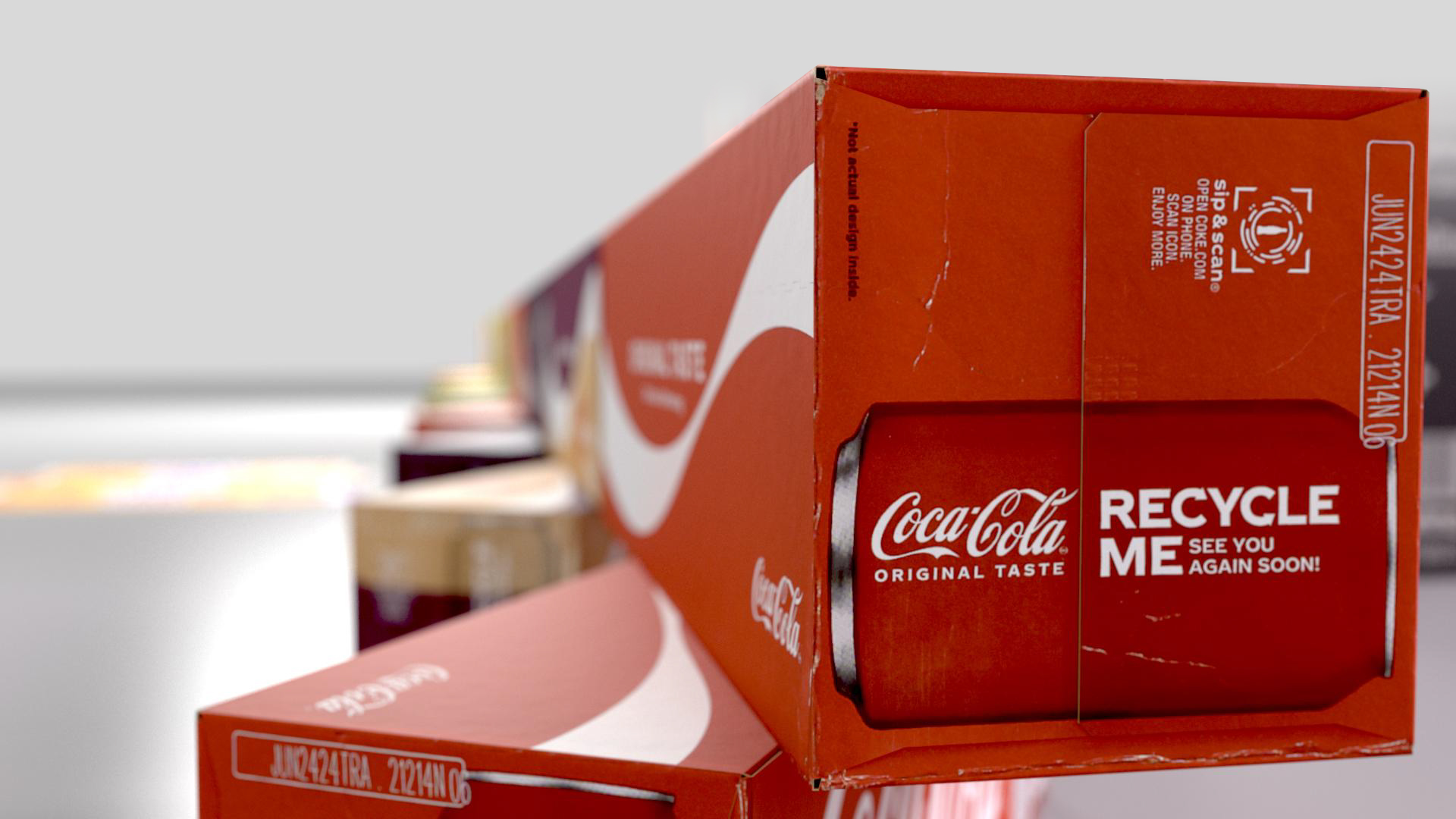
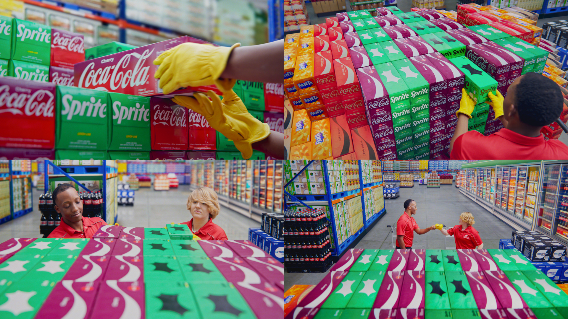
Our CG team paid meticulous attention to detail, from the perforations, folds and imprints on the boxes to the texture of the imperfections, we ensured that each CG-rendered image was a faithful replica of its real-life counterpart. To reinforce the illusion that our viewers are looking at actual products and to bridge the gap between CG and reality, we strategically intercut close-ups of real, physical Coca-Cola products. The interplay of real product close-ups served as visual anchors that ground the viewer’s experience in the tangible world.
We created our animation in 2D using a set of predefined colors, this was then piped through scripts into Houdini to turn the 2D into 3D product cases based in their colors. Once the base animation was established, the 3D artists rounded out the look to sculpt in more dimension to the models and then tracked them into our live action plates.
Creating the Perfect Store.
To avoid the production logistics of shooting in a real grocery store just three weeks out from the holidays, we built our own store on a stage in LA giving us full access and control. Half practical and half CG set extensions, we designed the store exactly how we wanted it. To infuse our set with a sense of authenticity and spontaneity, we employed a lighting strategy that emulates natural, available light. The intention was to create an atmosphere that feels as though we’ve serendipitously come upon this scene, rather than one that appears artificially staged or overly produced. The set was then extended in post to make it feel like a larger, brighter store by adding a large roof, neighboring isles and store signage throughout.
Shooting a Magical Moment on a Typical Day.
The camera moves were designed to be simple and deliberate, allowing the magic of the unfolding story to be the focal point rather than the camera technique itself. This approach keeps the viewer engaged with the narrative flow, guiding their eye naturally to the points of interest without abrupt changes. There is a lot going on in the shot, but just like Transformers, we don’t need to explain the mechanics, it just needs to look dope! Take a look below to see behind the scenes.
